|
| |
Released At :
Font Creation Competition 2013
Achievements :
C64 Graphics Competition at Font Creation Competition 2013 : #28
Credits :
Download :
Look for downloads on external sites:
Pokefinder.org
User Comment
Submitted by xIII on 9 August 2013
Great font !
Good to see another 'active' wow member :p |
User Comment
Submitted by Didi on 9 August 2013
| Just correct and replace screenshot and file. |
User Comment
Submitted by Bud on 9 August 2013
Didi: I prefer to always create all characters of a font, and indeed i've used the euro sign instead of the pound sign :)
Concerning the two swapped characters, i had not noticed that! It's documented in the production notes now. |
User Comment
Submitted by Didi on 9 August 2013
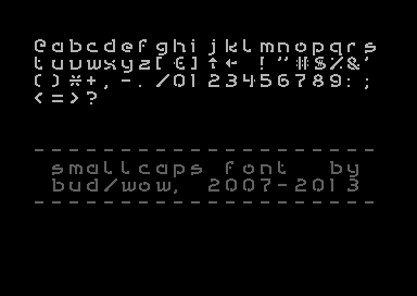
Very complete, even arrows, @ and £ (used as ) are there.
: and ; seem to be exchanged. |
User Comment
Submitted by Bud on 9 August 2013
You're right TheRyk, it looks a bit weird like this, all characters are aligned to the left side.
It was meant to be a proportional font; perhaps i should have coded a viewer to display the font proportionally. But since it's in the compo like this i guess i shouldn't be changing the display routine. |
User Comment
Submitted by Oswald on 9 August 2013
| cool distinct style, unlike many others in the compo which look just like the 100s of charsets I've already seen. |
User Comment
Submitted by celticdesign on 9 August 2013
| What ThyRky said. Nevertheless a very nice font! |
User Comment
Submitted by TheRyk on 9 August 2013
The "i" and the "1" should be centered, otherwise the distances look odd like in "2013". Same seems true for some other chars such as the brackets.
Apart from that, a pretty nice font. |
|
|
|
 | Search CSDb |
|
| Navigate | |
|
| Detailed Info | |
|
| Fun Stuff | |
· Goofs (1)
· Hidden Parts
· Trivia
|
|
| Forum | |
|
| Support CSDb | |
|
 |  |
|