|
| |
Credits :
Download :
Look for downloads on external sites:
Pokefinder.org
User Comment
Submitted by Sounx on 16 January 2014
| Now this is a straight 10 in my view. The filling and the style of the letters match very well and this creates an awesome visual experience. Top work!! |
User Comment
Submitted by Medicus on 14 June 2007
Unfortunately you never saw logos like this in older demos. A shiny 10 for this :)
|
User Comment
Submitted by Darkus on 16 May 2007
User Comment
Submitted by chatGPZ on 2 April 2007
| simply amazing, don't stop! |
User Comment
Submitted by jailbird on 2 April 2007
User Comment
Submitted by Valsary on 22 March 2007
| Archmage, you rock!!! True Amiga OCS/ECS style on c64 :) |
User Comment
Submitted by Ant on 20 March 2007
Amiga rules!
Ant/ex Three Little Elks on the Amiga..
|
User Comment
Submitted by ... on 20 March 2007
| nice! I like these type of fonts family. |
User Comment
Submitted by Jak T Rip on 20 March 2007
____ultra____!!!
Yes, we want a real picture from you!
|
User Comment
Submitted by Deev on 19 March 2007
| I liked the last logo a little better, but this is still another nice one! not sure why some people dislike the triangle, I think it works quite well. Definately the best old-skool logos of late. |
User Comment
Submitted by Hoild on 19 March 2007
| Amiga style indeed, and brings about sweet memories of youth... |
User Comment
Submitted by Dr.Strange on 19 March 2007
User Comment
Submitted by DeeKay on 19 March 2007
| Very very nice, me likey lots! Though the Bitfellas-Logo was even better, the colorscheme was just amazing!... |
User Comment
Submitted by JackAsser on 19 March 2007
| Super nice! And yes, not only Dekadence needs graphicians... =) |
User Comment
Submitted by HCL on 19 March 2007
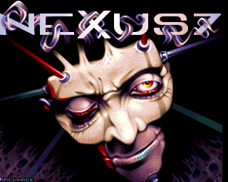
| Phrescsz!! Can i have one saying BoozeDesign :). |
User Comment
Submitted by Motion on 19 March 2007
| Holy moly! Pure class! This is some fine shit. Keep 'em coming Archmage... |
User Comment
Submitted by Shadow on 18 March 2007
Cool stuff! Both this and the earlier Bitfellas logo has a somewhat unique feeling to it. Perhaps it's the "Amiga-style", or perhaps that the color-choices are a bit different from what you normally see in C64-logo.
Anyway, top quality work! |
User Comment
Submitted by Scout on 18 March 2007
Can't wait for you creating these kind of gfx again...
Dekadence is looking for gfx-ians btw *hinthint* :D |
User Comment
Submitted by Nightlord on 18 March 2007
| I love this one as much as the previous. Forgive my lack of gfx knowledge but what do you guys mean when you say these logos are Amiga style ? What is an Amiga-ish logo exactly? |
User Comment
Submitted by RaveGuru on 18 March 2007
User Comment
Submitted by Oswald on 18 March 2007
| its really refreshing to see amiga style logos on the c64, I dont think logos were done in this style so far. And the quality imho is as good as it can get on the VIC :) I wonder how many pms Archmage got about joining this or that group already :) |
User Comment
Submitted by Intensity on 18 March 2007
| Just AWESOME logo. Thumbs fucking UP! |
User Comment
Submitted by Yazoo on 18 March 2007
| yo... the triangle is so-so, but the logo itself is really great! im looking forward to some non-fli pics (some multicolor fullscreen pic maybe?) nice to have you in the c64 scene. keep up the good job. |
User Comment
Submitted by Archmage on 18 March 2007
Heyhey!
I'm very grateful to Hein for the exe version. Also big thanks to Stainless Steel for making one, even though I couldn't manage to get it to work. Probably just me. Anyway, I really really appreciate it, guys!
Linus: Mr. Man is trapped in his cryonic freeze chamber. We've tried to revive him, believe me. No such luck.
BTW, good job on the last track on The Wild Bunch. It even made my gf dance, and she's not into demos at all.
Sander: what's retro these days anyway? ;)
|
User Comment
Submitted by Linus on 18 March 2007
| Great to see an old Amiga legend around. Now let's get Mr.Man to do some sids :) |
User Comment
Submitted by Sander on 18 March 2007
User Comment
Submitted by Scout on 18 March 2007
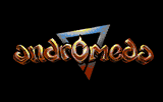
@wile: the triangle is the well-known Andromeda logo.
And yes, this one is very pwetty two!
|
User Comment
Submitted by Steppe on 18 March 2007
| Simply awesome, such a dhephththt (sp?)!!! |
User Comment
Submitted by Mace on 18 March 2007
| I think some people ought to watch out, not to get knocked out of the charts by this pixel0r ;-) |
User Comment
Submitted by Stainless Steel on 18 March 2007
User Comment
Submitted by Rough on 18 March 2007
| very cool logo again, most people here could code a simple viewer, question is who from them isnt too lazy. 8) |
User Comment
Submitted by Archmage on 18 March 2007
Hi! It's me again with a new logo. I got so much cool feedback on the last one that I decided to do one more - yes, I know, attentionwhore ;). This one took a little longer and I'm not entirely happy about it, but it was still good fun. It's done in P1 with the same colour setup as the previous one. And it's actually _the_ first Andromeda logo done since 1994.
And once again I must apologize for not being able to make this an exe. I don't know the first thing about coding and I don't know anybody who codes on the c64 - so should anybody feel the call to make it executable they would have my everlasting gratitude. ;) |
|
|
|
 | Search CSDb |
|
| Navigate | |
|
| Detailed Info | |
|
| Fun Stuff | |
· Goofs
· Hidden Parts
· Trivia
|
|
| Forum | |
|
| Support CSDb | |
|
 |  |
|