|
| |
Credits :
Download :
Look for downloads on external sites:
Pokefinder.org
User Comment
Submitted by Kickback on 20 January 2009
| Well we all had to start somewhere... My earlier stuff was no better. Keep pounding those pixels and you will see.. |
User Comment
Submitted by G-Fellow on 31 December 2008
| Your right Fanta, i do not care what people here talking stupid stuff , some people make fun here about the picture that is not my problem, they are right, the logo is bad, but i put a bit of work in it so i did release it. Only the way some people talk here and act, they not sceners for me, they lame as hell. And no Fanta i do not quit the scene, i hope you don´t really want that, i thought we are some kind of scene friends. |
User Comment
Submitted by Fanta on 27 December 2008
| hey g-point. you shouldn't care reading all these stupid comments. it's not your best work but i like the 70s c64 style. if i was you, i would definitely quit the scene and let all the so called "sceners" behind you coz violation sucks big time. =))) |
User Comment
Submitted by chatGPZ on 9 December 2008
"ouch this is fugly, even worse than my lame pixel attempts in the 80ies (and I really sucked)"
word =D |
User Comment
Submitted by Stainless Steel on 9 December 2008
Generally speaking, it should be dead obvious that when releasing something (god forbid uploading it to CSDb)
one should always adhere to a certain level of quality.
time and time again we see people disregarding that rule
and who are surprised when the hammer comes down on them.
Adding insult to injury by ragging on other people who are light years ahead of them, accusing them of wiring is .. hilarious.
And then, make things worse by taking offense from the critics of others and then proclaiming "I QUIT THE SCENE"
(oh how many times have we heard those sweet words) is .. even more hilarious.
|
User Comment
Submitted by Tao on 9 December 2008
@G-Fellow: you know, after each comment from you I constantly expect to read "YHBT". I'm beginning to think that you're actually serious about your posts, which makes them all the more lame.
How can you honestly take affront when people criticise your "5-minute copy, paste and edit" logo, yet be surprised when people get offended when you complain about real works of art that probably took the makers a day or more to create (be they *based* on a real photograph/painting or just freehand)?
I've never seen Leon "in action", so I cannot personally vouch for him handpainting things, but his marvellous Windmill trilogy (Nightmare, DeathLand, Dream Land), for instance leaves little doubt that he has the technique and talent needed. Having a nice picture as inspiration, and pulling off a depiction of it masterfully on a limited platform is an artwork by itself.
As for Mermaid, I've seen her in action. I've seen her "real life" works of art. With just the tiniest bit of googling you could've done that too. There's no way in hell that Vanja would need to convert pictures.
So bluntly put, take gang-ed and gang-sodomise yourself with it; you seem to be in love with that editor; let it give some love back.
Back in the more hostile days of the 64 there'd probably already be a "Federation" against you, though in these more civilised days, why don't we let you be the honourary, and only, member of the Federation Against G-fellow, F.A.G.
Then again, that my sound a bit homophobic, which is definitely not what I intend; I have nothing against gay people. I do, however, have something against people that behave like they are buttfucking themselves with their heads... |
User Comment
Submitted by Steppe on 9 December 2008
Moloch, am I supposed to sort these words now so they make some sense? ;-)
As it seems you can't even take it if people play jokes on you because you released something that should've rather stayed in diskboxes. Sorry, but that's how life works. Good stuff gets applause, bad stuff makes people go "booooh". Some stuff is even so bad that people start laughing. |
User Comment
Submitted by Moloch on 9 December 2008
"Offend me here makes fun Steppe yes?"
:D |
User Comment
Submitted by yago on 9 December 2008
| Leon is a wise Guy, he does not react on every troll attempt. |
User Comment
Submitted by Mermaid on 9 December 2008
G-Fellow: You don't think YOUR comments offended anyone then? All the stupid humans in this world make me really sad too, we should start a club or something!
Quoting G-fellowthis lamer that put here a shit Civitas logo
Fixed it for you :) |
User Comment
Submitted by G-Fellow on 9 December 2008
Poor scene, about the most people i don´t care what they write here, they don´t know it better. But Steppe that you are such coward, that makes me sad. Offend me here makes fun Steppe yes? Steppe you put the PC pic there from Leon and you don´t have the balls to ask if the pic is converted or hand painted from the picture.
About Leon, i did ask him if he had it converted, why Leon not say simply i did paint it from the picture and did not convert. He offend directly like this lamer that put here a shit picture. All that stupid humans on the world make me really sad. |
User Comment
Submitted by Tao on 8 December 2008
| Yay, finally something at least as ugly as my first production. So let me get this straight, G-Fellow: you have the *nerve* to come up with unsubstantiated claims about Mermaid's and Leon's awesome productions, yet produce this kind of total crap yourself? Yikes... |
User Comment
Submitted by Moloch on 8 December 2008
User Comment
Submitted by LordNikon on 8 December 2008
| Steppe: is that a turtle right under the artsy "S" ? |
User Comment
Submitted by Steppe on 8 December 2008
There, I knew right away this must be a convert job...

Wasserfarben... |
User Comment
Submitted by hintenanstellen on 8 December 2008
| Very nice work! It almost looks like the original JPEG. Sadly it's not possible to give my 10 for G-Fellow as a graphician :-) |
User Comment
Submitted by Mermaid on 8 December 2008
| No, I think maybe you should go have your eyes checked. And if you are delusional enough to think you can throw out ill-founded accusations left and right without getting any form of reaction from the people you're taking a virtual crap on, maybe you should get a few other things checked as well! Good day to you sir :) |
User Comment
Submitted by G-Fellow on 8 December 2008
| After those answers i did maybe speak the truth. Maybe i should stop with the scene, it makes no sense when the scene goes that way, like you show it here. |
User Comment
Submitted by Mermaid on 8 December 2008
| G-Fellow: Do you know anything at all about the scene? Besides, let me remind you that you are the one who accused me of not only converting jpgs and passing them off as my own work but also of looking like a monster, so what is your problem here exactly, mister? As for not being able to "speak normal", that's pretty rich coming from you sir. |
User Comment
Submitted by G-Fellow on 8 December 2008
| Muir oigh: Thats the right scene spirit, to put a shit picture here. You suck big time. You can not even speak normal and must do such a bullshit? |
User Comment
Submitted by ptoing on 8 December 2008
| Ahahahaha, oh man. So funny. *wipes tear* |
User Comment
Submitted by HCL on 8 December 2008
| That's the most talented comment ever :D. |
User Comment
Submitted by Mermaid on 8 December 2008
Don´t know what to believe about those great logos, many of them look converted with GangEd. For example this very logo from G-Fellow.
You only have to put some work in the converted logo and pixel the bugs out of the logo and make it look like the original .jpg:
 |
User Comment
Submitted by FMan on 29 November 2008
Hmm... It's slightly better than graphics I have done.
|
User Comment
Submitted by Richard on 29 November 2008
User Comment
Submitted by leonofsgr on 29 November 2008
| back to the '80 \o/ great color combination! and the dithering style is amazing! like the 90° lines! absolut best work! thumbs up dude! ;_) |
User Comment
Submitted by Skate on 29 November 2008
| I really liked this logo. I was having trouble with finding a product to give 1/10 for a while. Thanks ;) |
User Comment
Submitted by Oswald on 29 November 2008
| gfellow: FAIL :) that one has actually more carefully outlined letters, and even shadows :) and then we havent yet talked about the quite right skulls, tho no shadings.. |
User Comment
Submitted by SIDWAVE on 29 November 2008
User Comment
Submitted by LordNikon on 28 November 2008
| there's something what i've learnt during the years, do not release crap until someone says it's worth releasing it. |
User Comment
Submitted by Zyron on 28 November 2008
| It's just a joke, right? Please... |
User Comment
Submitted by CreaMD on 28 November 2008
| This is really bad. Both in shaping and "texture". Not worth releasing at all. I have few files made in past that have never been released, also a lot of worktunes that were never released and it will stay like that because sometimes it is better to keep some stuff for myself, or delete it. Unless you hope that it will get collector item, sometimes. This or that it's best to keep it hidden until someone else discovers it after our death... |
User Comment
Submitted by ptoing on 28 November 2008
| That is pretty crap as well, not quite as crap tho. |
User Comment
Submitted by G-Fellow on 28 November 2008
Oswald how you like this Red Sektor logo? 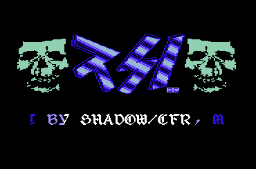
You find it here: Red Sector Logo |
User Comment
Submitted by G-Fellow on 28 November 2008
Ist schon ok Chico, ich wusste was ich tue :D "Trust me, i know what i´am doing" ;-) A good tv series. I know that the logo is not that good :D
But i thank you for the mostly constructive criticism. :) |
User Comment
Submitted by Oswald on 28 November 2008
| GFellow, I beg you to show me an uglyer one :D |
User Comment
Submitted by Frantic on 28 November 2008
| @G-Fellow: Yes.. If that is what you were aiming at, I think you are right. If I had seen this in a 1986 prod, then I would not really notice even, since a lot of stuff looked this way then.... |
User Comment
Submitted by RYGAR on 28 November 2008
| color reminds me of the old vortex 42 intros bilbo did back in 1987 (and also "colored" :) |
User Comment
Submitted by Chico on 28 November 2008
| I should have warned you, Gerhard. :( |
User Comment
Submitted by G-Fellow on 28 November 2008
| Yeah :D I´am not picasso, but many logos in the 80s had some kind of similar style. But it´s true painting is not mine. I would give a 3, its not a 0, i saw in the 80s more ugly logos in intros or demos. |
User Comment
Submitted by Burglar on 28 November 2008
ouch this is fugly, even worse than my lame pixel attempts in the 80ies (and I really sucked)
really, g-f, change professions, pixelling is not your thing. |
User Comment
Submitted by Jammer on 28 November 2008
| let's assume that g-fellow didn't release fire in his joystick unless he finished each letter. in this case, it's a masterpiece :D |
User Comment
Submitted by Conrad on 28 November 2008
It's ok for a first try (we all have to start somewhere), but I really have to say... the colour ordering is quite muddled.
$0a, $02, $07 ... hmm. |
User Comment
Submitted by TPM on 28 November 2008
User Comment
Submitted by cba on 28 November 2008
| I remember doing this sort of stuff back in 1985 |
User Comment
Submitted by Scout on 28 November 2008
| must....not....make....comment....can't.....resist...myself....TEH HORROR!....ARRRRRRRRRRRRRRRRRRRRRRRRRRRRRRRRRRGH! |
User Comment
Submitted by Stainless Steel on 28 November 2008
User Comment
Submitted by Frantic on 28 November 2008
Looks like one of the first attempts at a logo by a 10 year old or so. (The "A" is especially horrible, since it is not aligned at all heightwise with the other characters..)
So.. Nice! ;) |
User Comment
Submitted by Mace on 28 November 2008
As you aren't credited for graphics before, I'd say it's nice you gave it a try.
Pity you released it, though ;-) |
User Comment
Submitted by G-Fellow on 27 November 2008
User Comment
Submitted by iAN CooG on 27 November 2008
|
|
|
 | Search CSDb |
|
| Navigate | |
|
| Detailed Info | |
|
| Fun Stuff | |
· Goofs
· Hidden Parts
· Trivia
|
|
| Forum | |
|
| Support CSDb | |
|
 |  |
|