|
| |
Released At :
X'2010
Achievements :
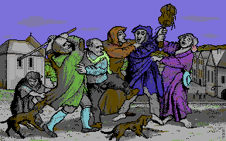
C64 Graphics Competition at X'2010 : #3
Credits :
Download :
Look for downloads on external sites:
Pokefinder.org
User Comment
Submitted by Oswald on 9 October 2010
| always loved Bimber's hires artwork, and this is just one step forward :) Great stuff! |
User Comment
Submitted by PAL on 8 October 2010
| This is really really great... the image is standing out as an old classic from a master in the last century... It is very good this! I like a lot... |
User Comment
Submitted by Frantic on 8 October 2010
User Comment
Submitted by Jammer on 8 October 2010
| i have to defend this stunning piece of work. regardless of how harsh is the style, topic chosen by bimber is very distinctive and unusual, especially for topic-wise limited scene standards. hence i see it as extraordinary valuable. keep it up m8! |
User Comment
Submitted by hedning on 8 October 2010
| Hm. Interesting and unusual use of a medieval theme and style, but obviously overrated at the compo. Too high scores compared to many of the other less high rated. |
User Comment
Submitted by Tim on 7 October 2010
| sorry, but should be way lower in the compo |
User Comment
Submitted by Wile Coyote on 5 October 2010
The theme isnt really my thing. The hires black out line is ok.
It looks primitively coloured in. Maybe the Nufli format influenced voters? |
User Comment
Submitted by booker on 5 October 2010
Hey, what are they doing with Leming's violin? :)
Proper job, Bimber ;) |
User Comment
Submitted by Jammer on 5 October 2010
| bosch on c64 - impressive! |
User Comment
Submitted by TPM on 4 October 2010
User Comment
Submitted by saehn on 4 October 2010
| Neat pic, but I'm not sure why it placed so high (especially compared to 4th, 5th, and 6th place). It seems to be a recreation of a standard medieval scene with flat coloration and coloring-book outlines. Not sure that it's an original composition, either. Eh, compo voting doesn't always make sense to me. :-) Congrats anyway. |
User Comment
Submitted by Norvax on 4 October 2010
| Liked the style a lot. One of the graphics that amazed me in first sight. Congratz. |
User Comment
Submitted by wacek on 4 October 2010
| I was expecting to be surprised, and I wasn't disappointed :) You got style, ziomek ;) |
User Comment
Submitted by mikme on 4 October 2010
| Nice colors though a bit strange people. |
User Comment
Submitted by Moloch on 4 October 2010
Love the picture and style for c64 ... typical day in Europe ;)
|
User Comment
Submitted by Hoild on 3 October 2010
| Simple but coherent visuals. It feels refreshing to see a decent example of a rare gfx approach on the C64. |
User Comment
Submitted by Joe on 3 October 2010
Hehe, back to Middle Evil Times.
Great |
|
|
|
 | Search CSDb |
|
 | Navigate |  |
|
 | Detailed Info |  |
|
 | Fun Stuff |  |
· Goofs
· Hidden Parts
· Trivia
|
|
 | Forum |  |
|
 | Support CSDb |  |
|
 |  |
|


