|
Pixel Porn Providers [2013] |
AKA :
Creepy Characters
Released At :
3-Color-Logo Competition 2013
Achievements :
C64 Graphics Competition at 3-Color-Logo Competition 2013 : #14
Credits :
Download :
Look for downloads on external sites:
Pokefinder.org
User Comment
Submitted by FATFrost on 4 October 2020
User Comment
Submitted by iLKke on 29 August 2013
User Comment
Submitted by Bob on 16 March 2013
amazing art, is that PAL ;)
|
User Comment
Submitted by Magic on 16 March 2013
| Needs some more astra and infinitum! |
User Comment
Submitted by Hammerfist on 8 March 2013
| Very daring. I don't like it, I'm sorry to say, but my respect for the style and skill. 8/10! |
User Comment
Submitted by Smasher on 7 March 2013
User Comment
Submitted by Shaun C on 26 February 2013
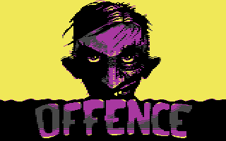
Zombie, or hillbilly? I suspect hillbilly, which is potentially even more dangerous. Those eyes mean business!
Bold colours, clever char re-use, and of course top notch skill makes this one a treat.
|
User Comment
Submitted by grasstust on 25 February 2013
| Love this! Again, Archy uses bold and surprising colours, and puts just enough pixels on the screen to dazzle me! Great work! If I can have one complaint it's that I think it's just a little too much yellow. If the yellow had stopped by the width of the logo it could have had a nice poster feeling, imho. |
User Comment
Submitted by Magnar on 25 February 2013
The logo itself has a bit of a boring choice of font type, but the light-splash and gradient is nice on it.
The head sticking up behind the logo is just excellent, especially for 3 colors. I would say that as a logo could have looked better, but the graphic around is just top-notch! It strikes out as very high quality work, Archmage :) |
User Comment
Submitted by Frantic on 25 February 2013
@HCL: Odd colors in a way, maybe, but on the other hand classic complementary colors (yellow <> purple) :)
@Arch: Good stuff! |
User Comment
Submitted by Joe on 25 February 2013
User Comment
Submitted by Magic on 25 February 2013
| Its written in the stars of a certain galaxy: this is top notch creativity and art! |
User Comment
Submitted by spider-j on 25 February 2013
| yep, colors are great - especially on real CRT! |
User Comment
Submitted by user on 25 February 2013
| Awesome! And i really love this cool color combination. |
User Comment
Submitted by TheRyk on 25 February 2013
| What Moloch said, though it fulfils this competition's rules and looks just great. |
User Comment
Submitted by redcrab on 25 February 2013
User Comment
Submitted by Devistator on 25 February 2013
| Lovely logo and pic! Interesting choice of colours.. |
User Comment
Submitted by Yazoo on 25 February 2013
| very intersting use of colors, which definitely makes this different from the rest. |
User Comment
Submitted by Oswald on 25 February 2013
| Love how Archie brings the clean "amiga" style with stylish yet so amigaish gradients. So different, and yet so nice. |
User Comment
Submitted by HCL on 25 February 2013
| Amazing! Very different from common logos, and odd choice of colors. You are a true master!! |
User Comment
Submitted by hedning on 24 February 2013
User Comment
Submitted by Deev on 24 February 2013
| Excellent! I really like the unusual combination of colours! |
User Comment
Submitted by PAL on 24 February 2013
| I love it. Really so cool... The logo is like a film!!! Return of the hair to the side zoombies... And must say i admire the colors... Hmmm that was a new range i think! |
User Comment
Submitted by FATFrost on 24 February 2013
Yikes... Archie I knew you would bring top shelf material to the compo, I didn't know it would be porn related top shelf... Gaga
Awesome. |
User Comment
Submitted by bugjam on 24 February 2013
| Holy cow, this is awesome. I hope the original image makes it to some fancy demo part - it cries for it, really. :-) |
User Comment
Submitted by Moloch on 24 February 2013
| I like the zombie (?), but this is a fullscreen graphic really |
|
|
 | Search CSDb |
|
| Navigate | |
|
| Detailed Info | |
|
| Fun Stuff | |
· Goofs
· Hidden Parts
· Trivia
|
|
| Forum | |
|
| Support CSDb | |
|
 |  |
|