|
| |
|
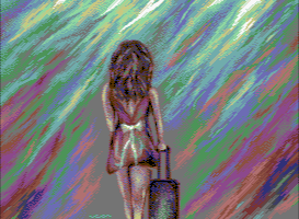
Never Left and Never Arrived... [2013] |
Credits :
Download :
Look for downloads on external sites:
Pokefinder.org
User Comment
Submitted by bygone on 28 September 2013
| LSD or not, beautiful color usage. Top notch! |
User Comment
Submitted by FATFrost on 27 September 2013
A really nice piece of art Leon. I have those feelings too at the moment.
Background really makes it for me. Its not like anyone else's work which is the reason I like your pieces. :) |
User Comment
Submitted by HCL on 27 September 2013
User Comment
Submitted by leonofsgr on 27 September 2013
Well, let me share some thoughts about the picture.
I received much criticism from people about the emptiness and lackingness in
the picture because only a small part of it is figurative and the rest looks
like some LSD trip. Now, if you feel something is lacking and the background
is empty then my picture did reach the intended effect: it is expressing my
recent negative romantic experience. The conflict is portrayed by the
contrast of the rich, vibrant atmosphere with the fading and disappearing
girl.
For a time I am trying to draw scenes out of my imagination, without using
reference photos, so I stopped with copying and try to express feeling and
emotions in my drawings... I want to evolve beyond the prevalent "photocopy
art" because that limits a graphician's progression and does not provide
artistic sustenance.
The base colour for the background is mid-gray, a tone that matches almost
every other tone in the VIC palette and allows for fine dithered colour
gradients. I tried to create "new" kinds of colour gradients, and at first
sight that might be overt and way too saturated, yet I tried to apply a
sense of style and doing it in a tasteful way.
I agree that the figure is anatomically incorrect. There is progression to
be made, way to go. But I have to start somewhere: the pictures of the
shark, the bird, and this one are my steps into that direction.
Finally, I was curious what I can achieve by applying my HIRES technique and
methods to an IFLI picture. I really like the "painted" look and the "brush
strokes" for mixing tones. It is challenging to create a picture this way,
making all those pixels unite into a "paint on canvas".
So these were my goals and intent with this picture. Thanks for your
attention! |
User Comment
Submitted by Deev on 27 September 2013
| It's great that you're doing no copy pictures, I can appreciate that it's MUCH harder. The arm pulling the luggage doesn't look quite right, I think it would bend a little differently and perhaps should be slightly longer (eg http://www.masterfile.com/stock-photography/image/6108-05873256..). Personally I liked your last picture a lot more, but I know different people appreciate different things. |
User Comment
Submitted by dink on 27 September 2013
User Comment
Submitted by Oswald on 27 September 2013
| fuck me for not replying on your editing problem, sorry mate. :( Turned out a great pic, I really like it :) |
User Comment
Submitted by Bitbreaker on 27 September 2013
| Flickering Farbgeschwurbelgalore :-/ |
User Comment
Submitted by TheRyk on 26 September 2013
To my mind, there is a little too much background. Focus more on the motive/centre of the picture or create some real background with details, not only this typical color explosion. You can't catch anyone with mere LSD colors in whatever fancy gfx mode nowadays.
I must once again admit that I'm no fan of all those huppyfluppy gfx modes like FLI anyway, but I think even if that wasn't the case, the mere background - though it is technically excellent and looks as colorful as it might possibly look - is a little boring if you have seen it as often as we did in recent state of the art releases, even in "mere" HiRes.
Compared to your other recent releases this is rather so-so. Still, that's criticism on a high level, it's a very good piece of art, but from someone as skilled and talented as you, I expect even more. |
User Comment
Submitted by Yogibear on 26 September 2013
User Comment
Submitted by Magnar on 26 September 2013
I would have enjoyed more seeing the front of that girl :)
Nice use of colors! A bit empty on the sides of the girl. A blurred out Airport scenery or a long road in desert "route 66" or something might have fit better. But, as art - it's good.
Extra Kudos for the nice use of colors and work on the briefcase. |
User Comment
Submitted by Cobra/Samar on 26 September 2013
Leon wrote: 100% no copy!
suprise;)
Nice pic. |
User Comment
Submitted by SIDWAVE on 26 September 2013
User Comment
Submitted by leonofsgr on 26 September 2013
100% no copy!
the zip file included:
-phases .d64
-runnable format
-pixel perfect format
-screenshot (lace mode)
-screenshot (no lace mode)
-the first sketch, .psd (phoroshop image)
enjoy! |
|
|
|
 | Search CSDb |
|
 | Navigate |  |
|
 | Detailed Info |  |
|
 | Fun Stuff |  |
· Goofs
· Hidden Parts
· Trivia
|
|
 | Forum |  |
|
 | Support CSDb |  |
|
 |  |
|


