|
| |
|
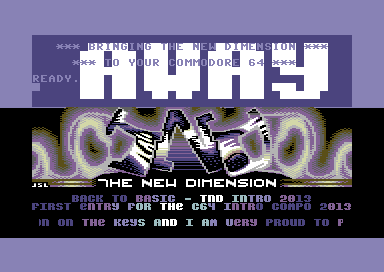
TND - Back to Basic [2013] |
Released At :
Intro Creation Competition 2013
Achievements :
C64 Demo Competition at Intro Creation Competition 2013 : #23
Credits :
| Code | .... | Richard of Blazon, People of Liberty, Psytronik Software, Scene World Magazine, The New Dimension |
| Music | .... | Flex of Artline Designs |
| Graphics | .... | JSL of Autumn Soft, Covenant, Creators, Raiders of the Lost Empire, Scene World Magazine, Software of Sweden, Tropyx |
| Charset | .... | BokanoiD of Avatar, Desire |
SIDs used in this release :
Download :
Look for downloads on external sites:
Pokefinder.org
User Comment
Submitted by daison on 5 December 2013
| in contradition to swingtro, the logo ruins it a bit for me in this one. nice intro nevertheless. |
User Comment
Submitted by TheRyk on 3 December 2013
Yup +1 @bepp
This intro with the logo from swingtro in blue palette... plus split before logo either with a complete rasterline flashing without interruption by logo _or_ (besides border) no flashing at all in screen/at that split would be close to perfect imho.
Very good one, however. |
User Comment
Submitted by bepp on 3 December 2013
| Not so fond of the logo but other than that, a fresh intro. Great choice of music! |
User Comment
Submitted by Hammerfist on 2 December 2013
| I just LOLed at the text in the top scroller. Thanks for pointing out that that particular scroller was *above* and not *below* the logo. I needed to hear that to be sure :P That said, although it was an original concept for me, I think leaving the C64 start screen visible looks messy. If it were me and I would have to do that, I would at least match the rest of the demo in color and not add all the purple and yellow. This way doesn't do the logo justice... 5/10 |
User Comment
Submitted by BokanoiD on 26 November 2013
User Comment
Submitted by spider-j on 25 November 2013
| Reminds me of a similar Onslaught (?) intro (?!? or was it Laxity ?!?), but I really like it. Music choice is superb. I really love Flex' style. |
User Comment
Submitted by Bob on 4 November 2013
| I find this intro very creative in design and has a nice style to it. |
User Comment
Submitted by BokanoiD on 26 October 2013
User Comment
Submitted by G-Fellow on 24 October 2013
| Good work and creative, Richard. I vote when the voting time starts... |
User Comment
Submitted by The Shadow on 20 October 2013
| Awesome effects the graphics have on the eyes ;) |
User Comment
Submitted by Dr.Science on 20 October 2013
Nice idea and execution!
READY. |
User Comment
Submitted by ron.sos on 20 October 2013
Well done Richard!
Nice logo JSL. |
User Comment
Submitted by Dr.j on 20 October 2013
| Good job Richard , nice intro mate . back to basic - back to roots |
User Comment
Submitted by Stinsen on 20 October 2013
| Yeah nice colors and can never go wrong with Flex. :) |
User Comment
Submitted by Yogibear on 20 October 2013
User Comment
Submitted by slimeysmine on 19 October 2013
User Comment
Submitted by STF on 19 October 2013
| Nice choice of color, cool intro in general, i'm just not very fond of the flashes. Good work ! |
User Comment
Submitted by Richard on 19 October 2013
| Here's my contribution to the Intro Creation Compo 2013. Enjoy :) |
|
|
|
 | Search CSDb |
|
 | Navigate |  |
|
 | Detailed Info |  |
|
 | Fun Stuff |  |
· Goofs
· Hidden Parts
· Trivia
|
|
 | Forum |  |
|
 | Support CSDb |  |
|
 |  |
|


