|
| |
Credits :
SIDs used in this release :
Download :
Look for downloads on external sites:
Pokefinder.org
Production Info
Submitted by The Phantom on 30 April 2014
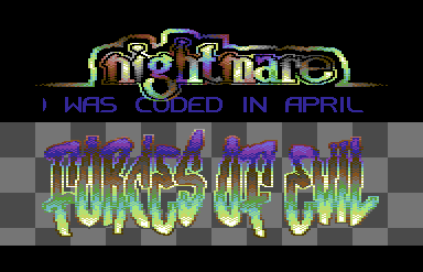
There are 3 different versions coded of this intro. The one you see, one that had split rasters within splits and another where I attempted to move the checkerboard using screen colors.
The logo(s) took a couple months. Before 2014, sometime in September, I decided to finish this intro. I added the sprites, which was fun because I have all the coloring going on. I think I use 8 for the little area, but the effect was what I wanted. I stared at the logo for a while (days) and went to work on making it smoother. I really like the upper logo, but the bottom logo isn't a fail either. It looks better without the rasters and I think I added them for an extra difficulty level, seeing how the checkerboard does go into the borders (did you notice?). Simple splits. While coding them, several other methods were opened up to me, on coding splits. I went to work and was able to get 14 or 15 splits per line and didn't have the bad line at all. This will be released soon.
I originally wanted the checkerboard to move. I did this wrong in several aspects. For one, I shouldn't have drawn it into the logo background. I shouldn't have hard-coded the splits in the borders (tedious) and I should have prepared a bit more, meaning a border-kill would have been far easier. I think I even discussed this on Driven.org but never figured it out, so naturally, I aborted.
The original music I wanted to use had no information as to who composed it. In the several folders I have, I cannot find the original sid. It so happens I code my parts around the music and graphics.
There were also unexpected delights with this intro. For one, when you read the scroll, it looks as if the logos are moving. You will also notice this when the scroll text ends. The only thing moving is the scroll. The coloring was also part of this effect. I started a demo about a year ago that was themed on 3-d effects, sort of like M.C. Escher, but more code based. Some of this brushed off when I re-edited the logo(s). The bottom logo could have been done better, more space between letters would have improved the visual. Retrospect is a mo'fo', ain't it? |
|
|
|
 | Search CSDb |
|
| Navigate | |
|
| Detailed Info | |
|
| Fun Stuff | |
· Goofs
· Hidden Parts
· Trivia
|
|
| Forum | |
|
| Support CSDb | |
|
 |  |
|