|
| |
Website :
https://www.youtube.com/watch?v=MYnUsBXBBjw
Released At :
Zoo 2015
Achievements :
C64 Graphics Competition at Zoo 2015 : #1
Credits :
Download :
Look for downloads on external sites:
Pokefinder.org
User Comment
Submitted by Manex on 12 November 2020
| Very nice example of old lumas power. So, it would be nice to see board with position for two VICII chips, and possibility for switch between them (like C64 reloaded MKII and its two SIDs sockets). Newer revisions of 6569 has new 9-levels lumas, but still significant better colours than later 8565! |
User Comment
Submitted by Oswald on 19 December 2016
| awesome pic, with awesome article. |
User Comment
Submitted by bepp on 18 December 2016
User Comment
Submitted by ilesj on 5 December 2015
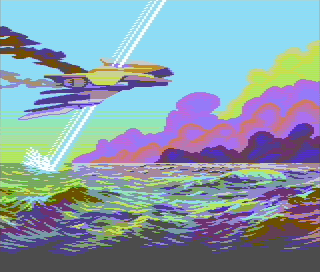
Here's an editor "screenshot" for you. No PAL/CRT emulation, and the colors are what I used for pixelling the image. The palette in question is pepto palette, but with old luma values.
.png) |
User Comment
Submitted by Jak T Rip on 28 October 2015
| Some really interesting unusual colour combos here. And I love sprite enhanced gfx. |
User Comment
Submitted by ruk on 26 October 2015
User Comment
Submitted by psych on 26 October 2015
User Comment
Submitted by Deev on 26 October 2015
| Beautiful! Excellent technique and the design really plays to the strengths of the old colour palette. Incidentally my first C64 had the old colours. I didn't even realise there were differences until it died and I got a replacement. I hated pixelling with the new colours at first! |
User Comment
Submitted by Flex on 25 October 2015
| Ilesj hit the spot again! Great to see such a great talent (and person, of course). :) |
User Comment
Submitted by Jammer on 25 October 2015
| You have to switch fullscreen for example - Vice will refresh whole screen. |
User Comment
Submitted by Monte Carlos on 25 October 2015
Why does the upper border change color to dark cyan if i switch to old luminances with VICE even though it has the same color as the background below with new luminances?
Does this make sense? |
User Comment
Submitted by ilesj on 25 October 2015
Hein is spot-on. This was mainly an experiment with old lumas and color blending. The clouds and the water were drawn first to be able to just draw with colors. The craft & etc. were added as the last element.
@Bitbreaker, haha, good one :D
Thanks a lot Lemming! |
User Comment
Submitted by Frantic on 25 October 2015
User Comment
Submitted by lemming on 25 October 2015
User Comment
Submitted by Tao on 25 October 2015
| @Lemming: Thanks! Hopefully this will make people stop complaining about the screenshot looking fake without having checked it on a real machine with the old VIC luminances. |
User Comment
Submitted by lemming on 25 October 2015
User Comment
Submitted by Bitbreaker on 25 October 2015
| i fecking <3 the watersurface and the stacked clouds, especially the yellow greenish one in the most background, but that is, that i love stacked sceneries anyway, be i clouds, mountains, boobs. |
User Comment
Submitted by Hein on 25 October 2015
| Great experiment with the old colours, a whole new range of possibilities open up. The picture is cool too, good definition, though it relies mostly on the colours and background scenery. |
User Comment
Submitted by Oswald on 25 October 2015
| ..okay it looks like the screenshot with old lumas. you are really stretching the HW here :) |
User Comment
Submitted by Oswald on 25 October 2015
| superb picture, which doesnt need this fake screenshot with non existing colors... |
User Comment
Submitted by Shine on 25 October 2015
| R E A L L Y great work! I like every pixel, BUT i really don't like this screenshot! ;) Anyway this is high quality (at least for me) ... i never saw a see like this before! ;) |
User Comment
Submitted by leonofsgr on 25 October 2015
| Hmm... fake colors and screenshot, but cool technique! |
User Comment
Submitted by Conjuror on 25 October 2015
| I really like the unique combinations of colour on the water. Has really great shape. |
User Comment
Submitted by Motion on 25 October 2015
| A wonderful pixel fantasy. |
User Comment
Submitted by PAL on 25 October 2015
| the ocean is just absolutely super blizz |
User Comment
Submitted by PAL on 25 October 2015
| Very cool and different and inspirational! |
User Comment
Submitted by Roysterini on 25 October 2015
This looks fantastic on hardware with a crt telly. Emulation doesn't do it justice.
Very nice. Love the colours and the use of borders too.
This is ART! |
User Comment
Submitted by Joe on 25 October 2015
User Comment
Submitted by Yogibear on 25 October 2015
User Comment
Submitted by ilesj on 25 October 2015
| View with PAL machine with old lumas (6569R1). Or use emulator with corresponding settings and a proper PAL/CRT emulation. |
|
|
|
 | Search CSDb |
|
 | Navigate |  |
|
 | Detailed Info |  |
|
 | Fun Stuff |  |
· Goofs
· Hidden Parts
· Trivia
|
|
 | Forum |  |
|
 | Support CSDb |  |
|
 |  |
|


.png)