|
| |
Credits :
Download :
Look for downloads on external sites:
Pokefinder.org
User Comment
Submitted by Deev on 15 August 2006
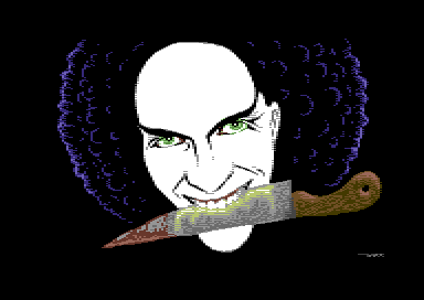
| Have to agree with several other here: I like the face a lot, but the knife doesn't seem to fit. |
User Comment
Submitted by Dior on 15 August 2006
| Wow, the face looks good and the knife should have been left out of the picture. |
User Comment
Submitted by Sander on 15 August 2006
| Nice expression on the face. But i feel the knive (in total) is of a different style.. The hair is somewhere inbetween somehow. Looks odd imho. |
User Comment
Submitted by HCL on 15 August 2006
I like the first screenshot better, this makes me feel blah blah.. Common, how lame to bring up that discussion again here!! Keep the bullshit in the goddamnforums! And now i had to screw it up even more, sorry about that.
I like the picture. It looks skillful considering the low amount of colors used. |
User Comment
Submitted by Jetboy on 15 August 2006
> No way this could be done in hires - or
> say goodbye to all the AA and colors in
> the hair.
The first verison that was posted here was not interlace-blurred, so it looked like it could have been done in hires, and it shurely could. |
User Comment
Submitted by enthusi on 15 August 2006
Nice indeed.
No way this could be done in hires - or say goodbye to all the AA and colors in the hair. I think the knife itself gives a nice extra with its transitions - true about the handle - now that I read about it. Nice kind of style |
User Comment
Submitted by Jetboy on 15 August 2006
| I saw the "hires" version of it - it seems it could be easily done in mufli, or just hires with sprites here and there. |
User Comment
Submitted by Zyron on 15 August 2006
| Nice one indeed. Have to agree with Groepaz about the knife's handle though. Personally I don't think the knife fits in at all, it would've looked better without it. |
User Comment
Submitted by chatGPZ on 15 August 2006
much better the new screenshot :)
so about the picture....the face is very cool. i find the handle of the knife a bit disturbing because the perspective is a bit wrong. |
User Comment
Submitted by Jak T Rip on 15 August 2006
Who cares about the screenshot!
Hey, this is a cool picture and DUCE, it makes my heart jump to see a new (and NICE!) graphic from you. You always were my favourite cover designer, btw. This pic has somehow the same "hiressy" style, just like the drawn ones, feels very small-dotted. |
User Comment
Submitted by jailbird on 15 August 2006
Although as discussed before, an interlaced screenshot should be blurred, yes. To be honest, at the first sight it confused me as well.
Optionally, a dithered one could be offered as a download link. |
User Comment
Submitted by duce on 15 August 2006
| hmm..ok, my mistake... maybe this shot should look more truthful |
User Comment
Submitted by chatGPZ on 15 August 2006
| radiantx: i'd refuse to call it "screenshot" at all. |
User Comment
Submitted by Radiant on 15 August 2006
| It's not really hard to specify the format when adding the pic to CSDb either... Though anyone who actually took a look at the screenshot could see it's not hires. |
User Comment
Submitted by jailbird on 15 August 2006
Guys come on, is it really so hard to transfer a small file to C64, check it out on the real deal, and form your opinion _after_ that? It wouldn't take more than three minutes.
BTW, the picture is great, I like the idea. |
User Comment
Submitted by chatGPZ on 15 August 2006
| bah, if its multicolor interlace, then why the hell is there a hires "screenshot" ? |
User Comment
Submitted by MRT on 15 August 2006
Nice picture...
Though he's drewling green shit over his knife. What's that? :-)
@TwoFlower:
This isn't a Hires piccy... It's multicol-interlace. |
User Comment
Submitted by Twoflower on 14 August 2006
| Nice and hiressy. Got to make one of these nifty hirespics myself one of these days. Glad to see more pictures released outside of the compos. |
|
|
|
 | Search CSDb |
|
 | Navigate |  |
|
 | Detailed Info |  |
|
 | Fun Stuff |  |
· Goofs
· Hidden Parts
· Trivia
|
|
 | Forum |  |
|
 | Support CSDb |  |
|
 |  |
|


