|
| |
Released At :
3-Color-Logo Competition 2013
Achievements :
C64 Graphics Competition at 3-Color-Logo Competition 2013 : #65
Credits :
Download :
Look for downloads on external sites:
Pokefinder.org
User Comment
Submitted by spider-j on 18 March 2013
| Nice. Best looking one from the big logos! |
User Comment
Submitted by Shaun C on 18 March 2013
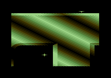
| Well, i enjoyed that wild fly-by over the camelot logo mothership. All it needs is dozens of tiny logos buzzing around it. ;) |
User Comment
Submitted by chatGPZ on 17 March 2013
| yep, what burglar said... from all the huge one i like this one best. the only way to improve it would be using stars for filling in the upper half =P |
User Comment
Submitted by Glasnost on 17 March 2013
| Probably the most important release for several years. :) |
User Comment
Submitted by Burglar on 17 March 2013
I concentrate on the pixelart, and this is the first clean big-ass-logo. the emboss effect works.
still, its unreadable ;) |
User Comment
Submitted by chatGPZ on 17 March 2013
| yes it improved a lot in recent versions thanks to a rather unexpected discovery.... protip: sound fragment size=very small :) |
User Comment
Submitted by iAN CooG on 17 March 2013
| scrolls fine with no bleeding at all here, Options/dx disabled unticked (hence dx enabled), Settings/video settings/render to dx primary surface unticked; double size, double cache video cache all ticked. Must be thanks to the gfx card, anyway VICE was never so smooth before, for me =) |
User Comment
Submitted by chatGPZ on 17 March 2013
| i have infact saved this into my testprograms directory - it shows *very* nicely how much scrolling on non synced display (aka emu) sucks donkey balls =) |
User Comment
Submitted by Digger on 17 March 2013
| @Yogibear: What? Glitches? From Cruzer? Impossible. Your emu sucks ;-) |
User Comment
Submitted by Yogibear on 17 March 2013
| Apart from a coding problem (glitches) it's cool! |
User Comment
Submitted by Mr. SID on 16 March 2013
| Largest logo ever! I approve... :) |
User Comment
Submitted by Cruzer on 16 March 2013
| @DGGR: There you go, although I think it kinda ruins the fun :) |
User Comment
Submitted by Digger on 16 March 2013
| @Cruzer: Please add the full png too :) |
User Comment
Submitted by Zierliches Püppchen on 16 March 2013
| Sadly too big ... u cant read the Letters anymore ... |
User Comment
Submitted by Joe on 16 March 2013
| Yeah! Diagonal rasterbars ;) |
User Comment
Submitted by Didi on 16 March 2013
Maybe I should add a special "biggest logo" award to the compo. ;)
It is valid concerning the rules. But as this is a graphics compo, voters should concentrate on the "pixel art" part of the release. |
|
|
|
 | Search CSDb |
|
 | Navigate |  |
|
 | Detailed Info |  |
|
 | Fun Stuff |  |
· Goofs
· Hidden Parts
· Trivia
|
|
 | Forum |  |
|
 | Support CSDb |  |
|
 |  |
|


