|
| |
|
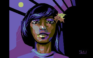
Summer Leaves, or Autumn Falls [2009] |
Website :
http://pixeljoint.com/pixelart/47037.htm
Credits :
Download :
Look for downloads on external sites:
Pokefinder.org
User Comment
Submitted by Akira on 24 October 2009
| I can't stop loving Skurwy's work. Pic after pic I am more sold into his art. |
User Comment
Submitted by Jucke on 21 October 2009
| Amazing. I totally love it. |
User Comment
Submitted by TomoAlien on 17 October 2009
| Very good picture! I like the style that uses clashes for a effect. Good job! |
User Comment
Submitted by The Shadow on 17 October 2009
| Emotions can be seen from her eyes. |
User Comment
Submitted by enthusi on 9 October 2009
Oh, usually I very much prefer HiRes that doesn't show any clashing or blocky style but this one really works for me ;-)
Nice!
The colors/outline (well everything except the beautyful face) remind me of "Another World" vector style which is also a good thing.
Nice! |
User Comment
Submitted by linde on 8 October 2009
| Really, really good use of hires! Embrace the attribute clashing! |
User Comment
Submitted by Deev on 7 October 2009
User Comment
Submitted by Hoild on 7 October 2009
| I would like a tad bit more detail and colour on the background. Way too plain as it is. Still the picture is nice to look at, but my eyes demand a bit more to it around the central figure. |
User Comment
Submitted by Skate on 7 October 2009
| I like this style. Hires power! |
User Comment
Submitted by Mace on 7 October 2009
We need to get Artstate of the ground again!
Very nice and much more positive than Industrial Dawn too. |
User Comment
Submitted by daison on 7 October 2009
| One of those pictures that you can stare at for quite some time... nice work! |
User Comment
Submitted by v3to on 7 October 2009
| very, very nice. i like your style anyway :) for me the "hair clash" is a not really at most a minor issue, because clashes are a style element in this picture... good work. |
User Comment
Submitted by skurwy on 7 October 2009
thank you for taking the time to check it out, and for the kind words! :)
@motion, mate; thanks, but i think i can pull it off by rearranging the hair highlights a little bit while i have a minute. plain hr is plain hr, no coding allowed! ;)
cheers! |
User Comment
Submitted by Motion on 7 October 2009
| @Jan Harries: ...that can be arranged, if Johnny is interested! |
User Comment
Submitted by Jostein Topland on 7 October 2009
User Comment
Submitted by SIDWAVE on 7 October 2009
| I like the technique. If only that block in the left side on the hair would go away.. |
User Comment
Submitted by Archmage on 7 October 2009
User Comment
Submitted by Sander on 7 October 2009
User Comment
Submitted by Joe on 7 October 2009
| The chunks of colorblocks doesn't bother me, since the image is well made. |
User Comment
Submitted by Motion on 7 October 2009
Awesome work, Jan. There's a nice level of detail here, and a cool lightsourced polygon vibe. Wicked!
|
User Comment
Submitted by plagueis on 7 October 2009
User Comment
Submitted by PAL on 7 October 2009
| Fantastic and cool... maybe some more black on the left side to avoid the color chars there...! |
|
|
|
 | Search CSDb |
|
 | Navigate |  |
|
 | Detailed Info |  |
|
 | Fun Stuff |  |
· Goofs
· Hidden Parts
· Trivia
|
|
 | Forum |  |
|
 | Support CSDb |  |
|
 |  |
|


