|
| |
Credits :
Download :
Look for downloads on external sites:
Pokefinder.org
User Comment
Submitted by katon on 8 October 2023
User Comment
Submitted by Mirage on 15 July 2010
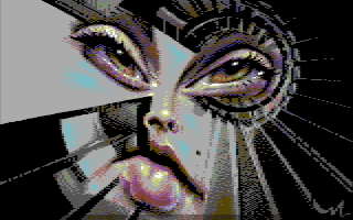
| Leave it to Ed&Joe to find something 'beyond the image surface' :) |
User Comment
Submitted by enthusi on 15 July 2010
User Comment
Submitted by Joe on 15 July 2010
| There is some hidden graphics in the right edge of the image (in the black). |
User Comment
Submitted by Morpheus on 26 November 2009
User Comment
Submitted by Motion on 19 March 2008
I really enjoy looking at this image. Great idea and those eyes are so captivating. Excellent work!
|
User Comment
Submitted by DeeKay on 18 March 2008
| Mirage goes Joe! 8) An intriguing idea, but since their styles are pretty much the complete opposite, it was bound to go wrong at some point. Lars seems to go for his classic colorful detailed anti-aliased pixel-perfection in some areas and does wide dirty joe-style dithering and "monochromeness" in the rest. If those areas were clearly separated it could've worked better, but as it is, it is pretty much just a hodgepodge.. Also, I can't tell stuff apart or recognize anything staircase-like on the left side of the picture... |
User Comment
Submitted by jailbird on 17 March 2008
| Hmm. Have mixed feelings about this one. Brings something new and exciting and the composition is simply awesome, but on the other hand I really miss the traditional clean style of Mirage which was the main reason why I felt in love with C64 pixelling in the first place. |
User Comment
Submitted by Mirage on 15 March 2008
Thanks for the comments :)
James: Those darker lines are there to annoy _you_ ;)
Arch: The sloppy pixeling was an experiment - to try and capture the error diffusion. Not sure if it worked out ok :/
Vanja: Sorry for stealing your trademark 'M', i'll try something different next time
Yazoo: There were only 3 workstages - one for each day i worked on this... Not really worth showing
Groepaz and others who said 'what groepaz said': A nice demo takes at least one year to finish and this took 3 days... Do you really mind our next demo will take 368 days instead of 365? |
User Comment
Submitted by Joe on 15 March 2008
| What's with the darker colors of the last 5 lines? |
User Comment
Submitted by Oswald on 15 March 2008
User Comment
Submitted by Archmage on 15 March 2008
| Very nice! I especially like the eyes. Very nice idea and execution. I think it is a bit flawed by the occasional sloppy dithering here and there, but that is of course a minor issue. |
User Comment
Submitted by Mermaid on 15 March 2008
| I like it, especially the little M in the corner. |
User Comment
Submitted by Yazoo on 15 March 2008
| nice one - but i have seen better ones from mirage. this is high quality anyways - workstages would be nice |
User Comment
Submitted by Rough on 14 March 2008
User Comment
Submitted by Ed on 14 March 2008
Hey come on. There are a lot of worse examples of scrambled faces! This is a good picture.
I really love the title, it works well with the image and makes me want to search for something beyond the image surface. Which by the way look rather interesting compared to other works seen from you, Lars. Here the dither techniques are more complex and feature a lot of darker colour combinations... (a bit 1990s I think... ) |
User Comment
Submitted by null on 14 March 2008
User Comment
Submitted by Deev on 14 March 2008
| Design-wise, I'm not crazy about that smudged style on the face, though I like the way it's all put together with the spiral staircase in the background. Pixel style is, as always, pretty faultless! |
User Comment
Submitted by Ed on 14 March 2008
...Different from you Lars. Nice move further out...
[Edit] J.S: Stairwell.. Probably something to do with staircase to heaven or "something".. Doing somebodys will...
I don't know.. Yep found it: I SELL YA WRATH! Naah.. Lars just pointed out the "STAIRWAY T HELL!"
But my twisted eye has not yet worked too hard on it... ;)
|
User Comment
Submitted by Burglar on 14 March 2008
User Comment
Submitted by Skate on 14 March 2008
User Comment
Submitted by Stainless Steel on 14 March 2008
User Comment
Submitted by A3 on 13 March 2008
| The eyes, ohhhh the eyes ... Brilliant |
User Comment
Submitted by Joe on 13 March 2008
;O
EDIT: There must be some code in the title, some hidden meaning. ...all their ways... |
User Comment
Submitted by MacGyver on 13 March 2008
| Awsome work once more. Just a little suprising this wasn't released at Forever party. |
User Comment
Submitted by chatGPZ on 13 March 2008
| awesome! (make stuff for demos though! <3) |
|
|
|
 | Search CSDb |
|
 | Navigate |  |
|
 | Detailed Info |  |
|
 | Fun Stuff |  |
· Goofs
· Hidden Parts
· Trivia
|
|
 | Forum |  |
|
 | Support CSDb |  |
|
 |  |
|


