|
| |
AKA :
Rotate Monitor for Tallpixels
Credits :
Download :
Look for downloads on external sites:
Pokefinder.org
User Comment
Submitted by Mermaid on 30 June 2011
That Ptoing sure can draw. And the yellow looks perfectly fine to me.
Ptoing: will you do a male "sequel" as well? |
User Comment
Submitted by DeeKay on 29 June 2011
| Ptoing: yeah, i read that, i was just pointing out that the feet clearly show she's not floating! ;-) And I gotta say I like the legs/ass, too. I like big butts and I cannot lie, you other brothers can't deny... P.S: Link works fine here, but maybe that's my browsercache.... Try copypasting it manually into a new window, so there's no HREF!... |
User Comment
Submitted by PAL on 28 June 2011
| Like it much... it is different and creates debate... That is very cool... Love the image and the colors do it for me... very cool direction! And me too love the shape of her, and man that is a pussy to focus in on! |
User Comment
Submitted by ptoing on 28 June 2011
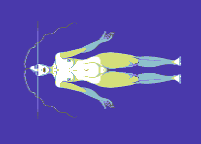
| I actually tried l.green, but I think the yellow creates a more interesting contrast, so that is why I went for it. Also that link does not work, but I think I know which one you mean :) Also, she is supposed to be standing, which I wrote before already :P |
User Comment
Submitted by DeeKay on 28 June 2011
Nice, and very hires-y for a mcol picture! ;-) I do think lt. green would've been a better choice than yellow though. And the feet look like she's standing on something, not floating in the water. the line through the head is a stylistic element, reminds me of certain Sorayama fembot pictures:
http://www.smartphone-daily.de/screenshots/original/2009/02/Haj..
|
User Comment
Submitted by ptoing on 28 June 2011
Thanks everyone :)
She is not supposed to be floating in water, but I can see how it would appear that way, she is standing. The colour separations are a purely stylistic choice. As far as proportions go, yes, the legs are pretty big, but I like that :D
The line is just there to illustrate the focusing of thought. |
User Comment
Submitted by Wile Coyote on 28 June 2011
The first thing that struck me was hi-res vibe, even although the image is lo-res. The figure floating in water, possibly a swimming pool, still vibe works well. The hands are really well drawn, although maybe the head should lean back a little and the feet point forward. I didnt get the out of place vertical line to the left and right of the face. Great image.
|
User Comment
Submitted by Yogibear on 27 June 2011
| This is something different! Nice! |
User Comment
Submitted by Joe on 27 June 2011
| Great to see some new works of art. I like the attitude towards shapes and colors in this one. Seemingly simple. |
User Comment
Submitted by FATFrost on 26 June 2011
| Nice work. :) also the legs aren't too thick as under water items appear larger, the main torso is above the water level and looks smaller. ;) |
User Comment
Submitted by Hermit on 26 June 2011
10/10. Not because I too like pussies very much, but because this is a very unique idea and workout both in regards of colours and orientation. This way multicolour pixels have just gone away as if it were hires or something...thup dude :)
|
User Comment
Submitted by TSM on 26 June 2011
| Quite nice overall, but I think the legs are too thick. |
User Comment
Submitted by Hoild on 26 June 2011
Stylish pic, but unlike other GFX by pt0ing, this one needs more detail. The reason I feel so is because this one offers a more realistic depiction of the human body than the usual, even more caricaturic graphics by the artist -- only those latter, being much removed from realism, work out well with pt0ing's characteristic minimalist, highly stylized pixelling.
And girl needs to take up running, or else she will grow a buffalo ass. \;]> |
User Comment
Submitted by Mr. SID on 26 June 2011
User Comment
Submitted by PAL on 26 June 2011
| That is really cool... thumbs up! |
|
|
|
 | Search CSDb |
|
 | Navigate |  |
|
 | Detailed Info |  |
|
 | Fun Stuff |  |
· Goofs
· Hidden Parts
· Trivia
|
|
 | Forum |  |
|
 | Support CSDb |  |
|
 |  |
|


