|
| |
Credits :
Download :
Look for downloads on external sites:
Pokefinder.org
User Comment
Submitted by Jak T Rip on 29 April 2012
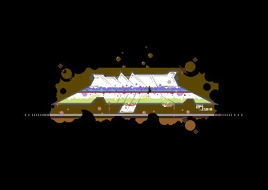
| Interesting one and I like sprite enhanced hires pics! |
User Comment
Submitted by Akira on 29 April 2012
Yep it is quite unreadable. To be honest, the palette/monitor combination I was using on the Amiga when I made it was clearly wrong. I also knocked up this real fast. But I wanted to put it out there otherwise I never make new graphics :)
I'll stick to Multicolor for a while from now on. Will experiment more with High Res later. |
User Comment
Submitted by deizi on 27 April 2012
| what? i can clearly read it. although that d is a bit .... |
User Comment
Submitted by Joe on 26 April 2012
If we only got that editor then.. That mode is perfect.
Somewhat cramped in space, but nice. |
User Comment
Submitted by bugjam on 25 April 2012
| If it was released on the website back then, I guess one could argue that THAT was the release date. ;) Doesn't really matter anyway. On the logo: not bad, but a bit too hard too read, and of course too many artefacts. |
User Comment
Submitted by Jammer on 25 April 2012
| interesting but completely unreadable :( |
User Comment
Submitted by Akira on 25 April 2012
No problem, fixed it.
I made the graphic back then and it was on the website since then, hence the date. |
User Comment
Submitted by Moloch on 25 April 2012
| If you just released it today with this entry, the release date should be the current date. |
User Comment
Submitted by Akira on 24 April 2012
I wanted to get this one off my virtual chest so here it is. I made it two years ago and it was a first try at making a High Res graphic. It has many clashing problems which I couldn't figure out how to fix back then (and I can't be arsed to clear now xD)
Pixelled on DPaint IV on the Amiga then converted using MUSC. I know, pretty lame. Sorry :P |
|
|
|
 | Search CSDb |
|
 | Navigate |  |
|
 | Detailed Info |  |
|
 | Fun Stuff |  |
· Goofs
· Hidden Parts
· Trivia
|
|
 | Forum |  |
|
 | Support CSDb |  |
|
 |  |
|


