|
| |
Credits :
Cracks which use this intro :
Download :
Look for downloads on external sites:
Pokefinder.org
User Comment
Submitted by Didi on 4 May 2012
User Comment
Submitted by Jak T Rip on 3 May 2012
| Wow, you can be proud that you got so many replies back! How do you do that? ;-) |
User Comment
Submitted by Didi on 3 May 2012
| @Zyron: Yawn... poor joke. |
User Comment
Submitted by Zyron on 3 May 2012
| Then you could fix & train it. ;) |
User Comment
Submitted by Didi on 3 May 2012
| Would be even cooler if you could really play! I remember an old Atlantis intro where it works. Don't know if it was ever used in a crack. |
User Comment
Submitted by chatGPZ on 3 May 2012
+ idea
+ no ripped graphics (is that a plus already?)
- way too modern music. this design needs more bleeps =)
- giant out of place name tag
- oldschool logo does NOT equal crap logo
- effortless non packed release
other than that, i wonder what makes this release a crack intro, its not the crack thats linked to it i guess? =P |
User Comment
Submitted by Matt on 3 May 2012
Chill out. Intro is pretty cool. The logo I find crap too.
Anything wrong with that? |
User Comment
Submitted by Britelite on 3 May 2012
| Okayish idea, but the execution leaves a lot to be desired |
User Comment
Submitted by Rough on 3 May 2012
| Full ack with Gothicman. Always those mega crappy shit discussions. Don't you have any other problems? Lamers. |
User Comment
Submitted by Chico on 3 May 2012
User Comment
Submitted by Skate on 3 May 2012
+ for original design
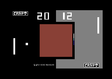
- for non-animated pong screen
i don't see it necessery to mention the already mentioned but it ruins the nice look of the intro screen, that's a fact. |
User Comment
Submitted by Axis on 3 May 2012
I like the Idea and always be happy to see some new old school stuff.. keep on ...
@Gothicman: "LIKE" |
User Comment
Submitted by Jon on 3 May 2012
| Your greet list is somewhat confusing. |
User Comment
Submitted by The Gothicman on 2 May 2012
fuck your logo-discussion...
the idea is quite cool and innovative!
back to the roots...
so don't smoke crack, brothers ;)
|
User Comment
Submitted by TheRyk on 2 May 2012
Not too bad idea. But I want a playable version ;)) At least some hard-coded animation would have been a nice and not too hard to do addition (and having done that, a playable version wouldn't have been very much more difficult).
|
User Comment
Submitted by TWW on 2 May 2012
To be fair; It does appear twice 8-D
Or in German: "Das logo gibt twei mal" or something like that. |
User Comment
Submitted by Troublemaker/Crypt on 2 May 2012
You don't really mean that. I want not do a better one for this becauze this fucking logo is good for this intro ! When i want do a better one in it then Dflame or Jsl can painted a better one for it !
The Logo is pure fucking old school style from the 70ties
But you cant be everybodys darling . |
User Comment
Submitted by iAN CooG on 2 May 2012
| you can't draw a bad logo and pretend it's ok saying it's oldschool, it's just bad. |
User Comment
Submitted by Troublemaker/Crypt on 2 May 2012
This is pure old school with an old school logo @ ian ! Or from what year is Pong ? In my mind the screen comes good !
Aber wie man schon auf deutsch sagt : Mann kann es ebend nicht jedem recht machen .
Oder auf Englisch : You cant be everybodys darling . |
User Comment
Submitted by iAN CooG on 2 May 2012
| that ugly crypt logo can't be seen, better change it or remove it to not ruin the overall aspect of the intro which is very simple but "working". |
|
|
|
 | Search CSDb |
|
 | Navigate |  |
|
 | Detailed Info |  |
|
 | Fun Stuff |  |
· Goofs
· Hidden Parts
· Trivia
|
|
 | Forum |  |
|
 | Support CSDb |  |
|
 |  |
|


