|
| |
|
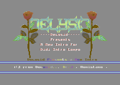
Take it easy with roses [2013] |
Released At :
Intro Creation Competition 2013
Achievements :
C64 Demo Competition at Intro Creation Competition 2013 : #36
Credits :
SIDs used in this release :
Download :
Look for downloads on external sites:
Pokefinder.org
User Comment
Submitted by daison on 5 December 2013
I like the writer and overall appearance.
Fader looks... unfinished? |
User Comment
Submitted by Hammerfist on 2 December 2013
| I'm surprised how readable the low-res version of the charset is :) Nice to see an intro with a different color background and the design to accompany it. My favourite Delysid entry for the compo. 7/10 |
User Comment
Submitted by spider-j on 2 December 2013
| I must admit I am someone who votes very "low"/"carefully" in general, but as I vote on every release in a competition I think it is fair for everyone. Usually no one gets down- or up-votes from me. I start with a "theoretically" vote of 5 - giving plus or minus points from that on (if you don't do any shit it's almost impossible to get lower than 3 from me, but it's not that easy to get more than 8 either). I like to have room for things that I really think that they deserve a "straight 10". |
User Comment
Submitted by iAN CooG on 30 November 2013
you said it yourself, it COULD have been cooler, but it's not. I'm voting for what I see, not what it could have been if it was made better. And apart that, votes are from personal tastes anyway. I couldn't vote 10 for a Picasso drawing that is valued millions of euros, to me it's just a bad drawing.
Code wise this could be a 6-7 but it's got too many little annoyances (logo is good but the roses are not, the scroll is annoying as much the tune bores me) that makes it less than sufficient for me. |
User Comment
Submitted by Scarzix on 30 November 2013
I just watched this intro for the first time, taking a look through the compo entries. I dont get it. Why has this intro been voted so low compared to many of the other entries?
There are some "stuff" that I might have done differently myself, but all in all is quite nice and different from many of the "old style" intros.
On the critics side, I would say that I had a little trouble reading the scroll because of the charset/color choice also the fade-in on the logo, could have been even cooler, if the logo had been hidden from start and then fade-in from background color or similar. The music is short, perhaps not my own musicstyle, but its quite fitting for an intro. All in all it deserves a LOT more than 4-5 in vote value.
Come on people, lets be fair. I give this a 7 minumum. |
User Comment
Submitted by spider-j on 25 November 2013
| what Ian & Groepaz said :) |
User Comment
Submitted by FATFrost on 17 November 2013
| I think this is great and the text fader is cool.... I always like something different!... After all we don't want to see the same stuff again and again do we? |
User Comment
Submitted by Richard on 17 November 2013
| Intro is Okay but definitely need to change the screen colour, and fix the colour bug where the plant gets drawn on to the screen. |
User Comment
Submitted by STF on 17 November 2013
| Music is cool, the effect at the beginning is not that bad, and gfxs are quite pretty. Good intro. |
User Comment
Submitted by Dr.j on 17 November 2013
User Comment
Submitted by Shine on 17 November 2013
User Comment
Submitted by dink on 17 November 2013
| I like it, don't be afraid to innovate :) |
User Comment
Submitted by chatGPZ on 16 November 2013
i agree with ian. its not the broken fade-in, its the ugly gfx that appears =P
i like the way letters appear in the middle though. |
User Comment
Submitted by G-Fellow on 16 November 2013
This version got not a probelm, like Dr.j wrote here...
To me this looks like Modern Art, the unpleasant becomes something good and I thought this is what Dr.j want to code as effect, I stay behind what Dr.j did.
To write something like you do iAN CooG means not that it becomes true or that it is true what you write. |
User Comment
Submitted by Dr.j on 16 November 2013
| Didi: its not buggy :-) this is the effect i wanted to achieve.. a bit strange, a bit uncommon (probably not so cool fade-in) but i wanted to colorize the "dirty" screen from right to left. hope still people will like the intro. Thanks to G-Fellow for his nice music and sorry for no greetings this time :-( |
User Comment
Submitted by Dr.j on 16 November 2013
| Xenox , i check it later , maybe one of the versions got a problem and need to be fixed |
User Comment
Submitted by iAN CooG on 16 November 2013
| good ideas are not enough, this is totally ruined by bad design/gfx/music. |
User Comment
Submitted by Xenox on 16 November 2013
| Yep. there is something wrong, Alex, the gfx is destroyed...! |
User Comment
Submitted by Didi on 16 November 2013
| Nice one overall, but the initial fade-in looks kinda buggy. |
|
|
|
 | Search CSDb |
|
 | Navigate |  |
|
 | Detailed Info |  |
|
 | Fun Stuff |  |
· Goofs
· Hidden Parts
· Trivia
|
|
 | Forum |  |
|
 | Support CSDb |  |
|
 |  |
|


