AKA :
Multiplexercise
Released At :
Intro Creation Competition 2013
Achievements :
C64 Demo Competition at Intro Creation Competition 2013 : #17
Credits :
| Code | .... | TheRyk of Arsenic, C64 Club Berlin, Mayday! |
| Music | .... | Fanta of Arsenic, Chorus, Oxyron, Plush, Viruz |
| Graphics | .... | Miro |
| | | TheRyk of Arsenic, C64 Club Berlin, Mayday! |
| Text | .... | TheRyk of Arsenic, C64 Club Berlin, Mayday! |
| Charset | .... | Iceout of Avatar, Digital Monastery |
| | | TheRyk of Arsenic, C64 Club Berlin, Mayday! |
| Ripping | .... | TheRyk of Arsenic, C64 Club Berlin, Mayday! |
SIDs used in this release :
Cracks which use this intro :
Download :
Look for downloads on external sites:
Pokefinder.org
User Comment
Submitted by El Jefe on 12 September 2021
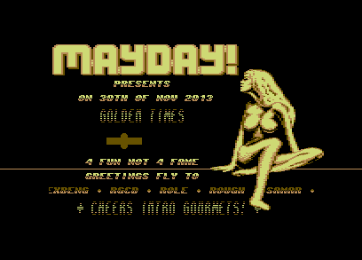
| She looks very impatient and unrelaxed, what is she waiting for, bobbing her foot and tapping her fingers? A bit sidturbing :-) |
User Comment
Submitted by bugjam on 20 June 2019
| Chick reminds me of Tetris. |
User Comment
Submitted by Doc Snyder on 11 June 2018
User Comment
Submitted by Jak T Rip on 3 January 2014
| Excellent intro with fascinating Fanta tune! |
User Comment
Submitted by Shine on 7 December 2013
| Nice intro, i like especially the sound. The bottom scroller is very hard to read when it's scrolling imho. Good work actually! :) |
User Comment
Submitted by daison on 5 December 2013
I actually like the chick (focussing on the boobs here ;) and the consistent color scheme. Tune rocks too.
Overall the intro is a bit too messy for my taste though. |
User Comment
Submitted by Hammerfist on 3 December 2013
| @TheRyk: glad I asked, thanks for clearing that up, lol! :) Makes the intro even better now! |
User Comment
Submitted by bepp on 3 December 2013
| Got gold feeling all right and a pair of twins. What's not to like? |
User Comment
Submitted by TheRyk on 3 December 2013
Thx again for all commenters and voters no matter what.
@Hammerfist: Thx to u 2, I fully understand the point of some critics. Just for explanation not for defense, that object ain't sprites, it's made of characters, supposed to represent a turning plane right before crashing... -> Mayday! ^^ All movement is supposed to be weird. I am weird, and so are most of my releases. But sometimes I compete nervertheless, not really for winning, just for fun. |
User Comment
Submitted by Rough on 3 December 2013
| Usually girls with that bust are called women, kids. |
User Comment
Submitted by Hammerfist on 2 December 2013
| TheRyk, your girl-gfx conversion is pretty decent. I agree with Mermaid's criticism, but love it nonetheless. What's with that wacky sprite in the middle though? The oval+bar shaped thing that just moves from left to right? I like how it breaks up the field with all the text, but other than that.. -1 for the weird movement of the girl but +1 for using that old school 1x2 font with the black raster lines :D 7/10 |
User Comment
Submitted by The Gothicman on 2 December 2013
User Comment
Submitted by TheRyk on 1 December 2013
Thx for feedback, no matter if positive or criticising.
Look at production notes for info about girl gfx.
@Death: But it _sounds_ more like ASC ;) Having used Fanta's great tune, I thought it was okay to label it a release _by_ ASC+MYD! _for_ Mayday! as some other intros in this competition. Originally, I wanted to do a hidden part, where palette changes to green and logo is replaced by ARSENIC, but ran out of time and RAM ;) |
User Comment
Submitted by N3XU5 on 1 December 2013
| nice one Björn .. but it looks more like a Mayday release as Arsenic ;) ... Voting will follow (on all entries for this compo) soon! |
User Comment
Submitted by celticdesign on 1 December 2013
| very nice, like the style alot. very kewl muzic. only girl and logo movement should be improved. |
User Comment
Submitted by spider-j on 30 November 2013
| Yep, thx 2 you Ryk, that you saved the (may-)day for this compo! ;-) |
User Comment
Submitted by Mermaid on 30 November 2013
| Poor girl, what happened to her legs? And neck...and stuff. |
User Comment
Submitted by G-Fellow on 30 November 2013
| I like this golden style intro. The tune from Fanta fit perfect to it. Everything together makes a damn cool feeling. |
User Comment
Submitted by Beastifire on 30 November 2013
| The name is apt, since the raster colours and the font give a golden feel to it somehow! Cool! |
User Comment
Submitted by TheRyk on 30 November 2013
ah damnit :) fixed in a rush, thx ian.
about cracks: after long abstinence from cracking, there will definetely be some cracks again by myd! in due time ;) |
User Comment
Submitted by iAN CooG on 30 November 2013
| works for me, expecting next mayday! crack using this, but add the space detection! |
|
|
 | Search CSDb |
|
 | Navigate |  |
|
 | Detailed Info |  |
|
 | Fun Stuff |  |
· Goofs
· Hidden Parts
· Trivia
|
|
 | Forum |  |
|
 | Support CSDb |  |
|
 |  |
|


