|
| |
Released At :
Syntax 2014
Achievements :
C64 Graphics Competition at Syntax 2014 : #3
Credits :
Download :
Look for downloads on external sites:
Pokefinder.org
User Comment
Submitted by Sith on 4 March 2015
| Highly original and refreshing concept and executed with excellent detail. I love this one. |
User Comment
Submitted by Jak T Rip on 4 March 2015
| Absolutely wow, a straight 10 from me. |
User Comment
Submitted by grasstust on 21 November 2014
| Should have won. I don't like the "comic-expression" of the thing, but all in all a great pic. |
User Comment
Submitted by Stinsen on 19 November 2014
User Comment
Submitted by iLKke on 17 November 2014
Thanks, all!
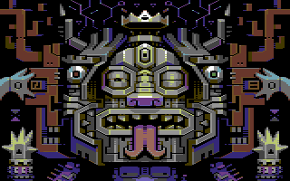
True, mirroring is an easy way out but I felt it worked for the totem-like picture (lightsource included). I had VERY little time to make this so I actually picked a motif that will work mirrored.
That said, there are some subtle differences between the halves, see if you can spot them all. If I had more time there would have been more.
@Deev: Indeed, pantherpants is a massive influence, as is the rest of Electric's work! And not only his.
@Jammer: I wouldn't say my relationship with Redcrab is particularly competitive :D |
User Comment
Submitted by wysiwtf on 17 November 2014
| i so dig this style, do more! |
User Comment
Submitted by Jok on 17 November 2014
beautiful, stylish, cool colors, perfect pixels -love it
Leon: mirror is used for purpose here,
but I'm with Redcrab about light |
User Comment
Submitted by Jazzcat on 17 November 2014
| Love this Ilija, thanks for your hard efforts again, see you at Flashback in some months time. |
User Comment
Submitted by Jammer on 16 November 2014
| Oswald, I think that redcrab proves more than worthy competitor in this field ;) |
User Comment
Submitted by PAL on 16 November 2014
| I so wish there were a LIKE button on your comment Oswald |
User Comment
Submitted by Oswald on 16 November 2014
| yes.. only ilkke can make 32 colors out of 16 owithout dither :) |
User Comment
Submitted by redcrab on 16 November 2014
<3
This is "hang on the wall material"
Ok. Consider not mirroring the lightsource next time, but it's still a beautifully crisp image with zero noise, and I totally love your style! |
User Comment
Submitted by PAL on 16 November 2014
| FANTASTIC! Best I have seen in a long time almost... Animated in a demopart, WOW then your talking... go make that... a demo in this style with animations sprites and vsp and plexers and rotating rasters and all... fantastic concept and it sure do look like nothing anyone else create! |
User Comment
Submitted by Deev on 16 November 2014
| Great! Really like the style. This would be the winner for me. It reminds me a little of Electric's Pantherpants, and that's one of my all time favourite C64 images. |
User Comment
Submitted by Jammer on 16 November 2014
| I'd love animated part in demo based on this face - parts that are hiding and appearing, alternating, moving ;] |
User Comment
Submitted by ilesj on 16 November 2014
| Instantly recognizable style, and damn cool picture! This is proper artwork! |
User Comment
Submitted by BokanoiD on 16 November 2014
| iLKke style == bESt style |
User Comment
Submitted by Shine on 16 November 2014
| Indeed it's hard mirrored, BUT i love this anyway! You are one of the top gfx artists in the scene. I like the "depth" of this picture. It's not as easy to create this as it seems for others. 9.4/10 ;) |
User Comment
Submitted by jailbird on 16 November 2014
Would guess it is Ilkke without seeing the credits, a recognizable, fascinating style <3
I'd love to see a high-end demo full with graphics from him. |
User Comment
Submitted by N3XU5 on 16 November 2014
User Comment
Submitted by leonofsgr on 16 November 2014
| don't like the "mirror" mode... pff... too easy... |
User Comment
Submitted by Motion on 16 November 2014
| Oh, wow! The colours, the shadows and the details. Dayum! |
User Comment
Submitted by Peacemaker on 16 November 2014
User Comment
Submitted by grip on 16 November 2014
User Comment
Submitted by Doc Strange on 16 November 2014
User Comment
Submitted by psych on 16 November 2014
| Awesome! I really dig your style. |
User Comment
Submitted by spider-j on 16 November 2014
| very nice one. for some reason I think this would have been a title/loader pic for assembloids. really like your style. |
User Comment
Submitted by Nith on 16 November 2014
| Just wow..! I really like your style, very unique, brilliant picture |
User Comment
Submitted by Unkle K on 16 November 2014
User Comment
Submitted by hedning on 16 November 2014
|
|
|
 | Search CSDb |
|
 | Navigate |  |
|
 | Detailed Info |  |
|
 | Fun Stuff |  |
· Goofs
· Hidden Parts
· Trivia
|
|
 | Forum |  |
|
 | Support CSDb |  |
|
 |  |
|


