|
| |
AKA :
Sockan & Honung
Credits :
SIDs used in this release :
Contains information on the following event(s) :
Scrolltext and other text in this release : ()
Download :
Look for downloads on external sites:
Pokefinder.org
User Comment
Submitted by hedning on 20 February 2016
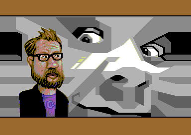
| Yeah. It's not easy to make me look that good. :D |
User Comment
Submitted by PAL on 20 February 2016
| Ment as a joke ofcourse and a prais to your pixel skills... fantastic skin on hedning and capture of him in so few pixels... ohhh the clean details. Superb work! |
User Comment
Submitted by Mermaid on 20 February 2016
Thank you for the kind comments, guys!
DKT, TheRyk, Ksubi: I'm so glad you like the music, that really means a lot to me <3
Quoting PALDid you use subsurface scattering and transparent multiple surface renderings on that skin, or is it only your own skin shader?
Hehe :) I don't really know what any of those things are, I just place pixels where they look ok to me, click click click. |
User Comment
Submitted by PAL on 20 February 2016
| Did you use subsurface scattering and transparent multiple surface renderings on that skin, or is it only your own skin shader? WOW... skin shader c64 just got better... Very nice screen. Remind me of my Duck It! Duck It! screen that Zappelappe and che coded at the X2014 party - those bastards, made me do the whole thing more or less again... Well... very cool screen! You are the best! |
User Comment
Submitted by Jak T Rip on 16 February 2016
| Small and detailed versus huge and backdropped... colourful versus greyscale. Very different styles and still they blend together as a whole... wow, this is really so brilliant in so many ways. And besides all of it, also each detail individually is nice. How can a rather small/uncomplex picture like a C64 screen have so many surprises that keep you looking here, then there, then here again... THUMBOES UPPOES! |
User Comment
Submitted by bepp on 15 February 2016
| Nominated in the category "Scrolltext of the year" :-D Enjoyed the read and the production altogether! |
User Comment
Submitted by DKT on 13 February 2016
| Listen to the tune since 30min :). Great work Mermaid. Cool gfx with border bars. |
User Comment
Submitted by Doc Strange on 13 February 2016
User Comment
Submitted by JAC on 13 February 2016
| Wow. Outstanding. Both parts of the pic are awesome by themselves - together they look Wow. |
User Comment
Submitted by Dr.j on 12 February 2016
| Very impressive gfx ! thanks for the nice release Genesis Project. Vanja and Hedning you did it again ;) |
User Comment
Submitted by Yogibear on 12 February 2016
User Comment
Submitted by TheRyk on 12 February 2016
| clever way how to integrate side border into screen gfx :) melikes, also the music, will enjoy the text later :D |
User Comment
Submitted by Shine on 12 February 2016
User Comment
Submitted by Ksubi on 12 February 2016
| Great little production, everything flows so well together... love the tune and the text!! |
User Comment
Submitted by FATFrost on 12 February 2016
User Comment
Submitted by Motion on 12 February 2016
| That's beautiful work! :) |
User Comment
Submitted by Mermaid on 12 February 2016
| 25kb of scrolltext, enjoy. |
|
|
|
 | Search CSDb |
|
 | Navigate |  |
|
 | Detailed Info |  |
|
 | Fun Stuff |  |
· Goofs
· Hidden Parts
· Trivia
|
|
 | Forum |  |
|
 | Info on other sites |  |
|
 | Support CSDb |  |
|
 |  |
|


