|
| |
|
Secret of the Forbidden City [2017] |
Released At :
BCC Party #11
Achievements :
C64 Graphics Competition at BCC Party #11 : #1
Credits :
Download :
Look for downloads on external sites:
Pokefinder.org
User Comment
Submitted by KAL_123 on 5 March 2021
User Comment
Submitted by Jok on 1 March 2017
User Comment
Submitted by TheRyk on 27 February 2017
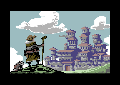
to me totally enchanting what you did with a relatively plain and straight style and motive in terms of perspective illusion, indeed a worthy winner!
blame me for using pepto palette screenshot when adding this release, feel free to replace as long as you don't use spectrum neon palette |
User Comment
Submitted by bugjam on 27 February 2017
| Great pic! Is this maybe already the first fan art for the upcoming Unknown Realm RPG? Doggy on this picture sure looks like a pug. :-) |
User Comment
Submitted by awsm on 27 February 2017
| Well deserved compo winner! |
User Comment
Submitted by Smasher on 27 February 2017
sorry mighty Ilesj, I partially agree with you: I think the castle on real c64 is "a little" less muted compared to the screenshot, not "a lot" less, IMHO.
using many black pixels on the foreground character (a dude holding a ice hockey stick? lol) and zero black pixels on the rest of the screen did the trick. |
User Comment
Submitted by rail slave on 26 February 2017
| By bringing in that atmospheric perspective you have made really good use of the limitations, hinting at so many more colors that wouldn't be picked up. really like. Inspired ! |
User Comment
Submitted by ilesj on 26 February 2017
| Too bad it's not C64 colors in the screen shot. The "shadow" colour in castle is actually dark blue, and it's a lot less muted on real C64. |
User Comment
Submitted by psych on 26 February 2017
User Comment
Submitted by Bitbreaker on 26 February 2017
| using less contrast on the castle works so very great here to put it into deep background, giving the impression it is a bit foggy. Also crisp and clear approach, me likes. |
User Comment
Submitted by Smasher on 26 February 2017
| that castle really looks like it is in background! 10/10 for me. |
|
|
|
 | Search CSDb |
|
 | Navigate |  |
|
 | Detailed Info |  |
|
 | Fun Stuff |  |
· Goofs
· Hidden Parts
· Trivia
|
|
 | Forum |  |
|
 | Support CSDb |  |
|
 |  |
|


