|
| |
Website :
https://github.com/magic-roundabout/femtotro-c64
Released At :
Intro Creation Competition 2018
Credits :
SIDs used in this release :
Download :
Look for downloads on external sites:
Pokefinder.org
User Comment
Submitted by chatGPZ on 11 January 2019
| nice indeed. shame i dont remember the original :) |
User Comment
Submitted by Jammer on 11 January 2019
| Very small and very slick :) |
User Comment
Submitted by Jammer on 11 January 2019
| @Bacchus: You're more than welcome to organize a small intro compo! I'll gladly participate. :) |
User Comment
Submitted by T.M.R on 9 December 2018
@Bacchus: This is a reworking of an intro which didn't have a tagline so it's just replicating that screen layout; the original didn't have one because I didn't want to store more text than necessary and this one can't because most of the screen RAM is filled with data. =-) I wouldn't have said it was a necessity personally, in part because one of my all-time favourite intros is Starion 02 which doesn't include one.
@TheRyk: I do like the 16K limit personally and wouldn't want to see it reduced, that's what I would've been aiming at when writing an intro back in the day and you can still have some fun size coding into that space, that's what I was doing with Koalatro a couple of years back. But I certainly wouldn't mind there being two categories for 16K and 4K in the competition next year either, especially if we're allowed three entries for each. =-)
As for appreciating small size... got to love the scene where "mine is smaller than yours" is a brag! |
User Comment
Submitted by TheRyk on 9 December 2018
Of course more people appreciate small size, at least I do. But what you criticize, Bacchus, is due to the soft restrictions of the ICC (16K) as I said before and will say again until it will be 4K one day or maybe at least reduced to 8K as in ChristopherJam's edition last winter. Often people seem to think they have to fill the 16k but have no better idea how than using whatever-sized music ;P
This release is a perfect example what's possible in next to no RAM and might motivate future compo hosts to rethink the 16k but maybe also more coders to participate when 4k or 8k compos are launched. |
User Comment
Submitted by chancer on 8 December 2018
| @Bacchus, didn't really care "back in the day" with the original version.. as folk had the attention of more than a gnat back in the day. I get what you're saying, but many of the others don't mention the title either.. check how much mr stark and myself used the original. it got many outings ;-) .. and MUCH imitated after by other groups. |
User Comment
Submitted by Bacchus on 8 December 2018
Nice and clean. My only remark would be that an intro is normally used in front of a product and then you need a line for the product name and most often a "tag line" as well...
But I appreciate a lot that the art of making intros that are not small demos is still very much alive! Especially not just importing a 17 block SID... |
User Comment
Submitted by Smasher on 8 December 2018
User Comment
Submitted by ccr on 8 December 2018
User Comment
Submitted by fieserWolF on 8 December 2018
| I like the sprite colors. Small remark: you could use !for instead of !do to set up the screen |
User Comment
Submitted by TheRyk on 8 December 2018
User Comment
Submitted by T.M.R on 8 December 2018
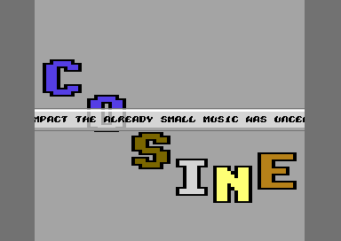
| I sort-of-remake of the Babygang intro I wrote in 1991, except it's been wedged into even less memory and does silly things to keep the overheads down further. =-) |
|
|
|
 | Search CSDb |
|
 | Navigate |  |
|
 | Detailed Info |  |
|
 | Fun Stuff |  |
· Goofs
· Hidden Parts
· Trivia
|
|
 | Forum |  |
|
 | Info on other sites |  |
|
 | Support CSDb |  |
|
 |  |
|


