|
| |
|
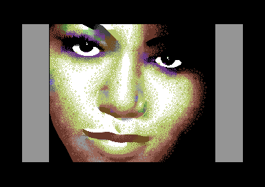
An Ugly, Single Color Female Face [2006] |
Credits :
Download :
Look for downloads on external sites:
Pokefinder.org
User Comment
Submitted by Rough on 9 December 2007
| great job. i wish i could paint only a 1/4 of that quality. |
User Comment
Submitted by _V_ on 9 December 2007
| Very nice, this kind of ugly :). Yet - I do count more colours than 1 ;). |
User Comment
Submitted by yago on 12 May 2007
User Comment
Submitted by Bizzmo on 24 October 2006
| I like a challenge, but Jailbird is just insane! The very idea of pixelling an image like this in hi-res gives me the willies! Very nice! |
User Comment
Submitted by Valsary on 24 October 2006
| WOW !!! ...just noticed it's pure hires 8-O |
User Comment
Submitted by Jak T Rip on 8 October 2006
The name says it all: you are a liar! :)
Stunning picture, even if it were afli it would rank among the good ones.
I personally adore the mouth. SOOOO smooth fading here, really making the impression.
On a different note, spritelayers do rule, usually... |
User Comment
Submitted by leonofsgr on 3 October 2006
User Comment
Submitted by LordNikon on 2 October 2006
User Comment
Submitted by Oswald on 2 October 2006
\o/\o/\o/\o/\o/\o/
\o\\o\\o\\o\\o\\o\
/o//o//o//o//o//o/ |
User Comment
Submitted by leonofsgr on 2 October 2006
| Dane: sprite-layer S U X ! ;_) |
User Comment
Submitted by jailbird on 2 October 2006
Thanks for your feedback, people!
The whole (stupid) idea was to check if I could do a plain bitmap picture with traditional dithering/coloring. A sprite layer would ruin the concept.
In case some of you missed it, "ugly single color" is a reference to the title of Mirage's hi-res picture (Single Colour is Ugly). Nothing to do with it though, just liked the title :)
@Helm: I was way below my lowest limit of motivation and patience when finishing that right part. Actually, the red to black dither on the image is almost invisible on the real deal. :) |
User Comment
Submitted by Mirage on 1 October 2006
User Comment
Submitted by Dane on 1 October 2006
| Spritelayer, Arnold, spritelayer! |
User Comment
Submitted by Mirage on 1 October 2006
Usually when eyes are completely white like this without any shading/shadowing/reflection they come out pretty dull without expression, but it seems to work OK here...
now back to plain old double-pixel heaven, arnold :)
p.s. the nose looks alright aswell ;P |
User Comment
Submitted by jailbird on 1 October 2006
@Leon

Prepare for the boozing on Function! \:D/ |
User Comment
Submitted by leonofsgr on 1 October 2006
| sux convert :_DDD \o/ 10/10 :_D |
User Comment
Submitted by markus sinalco on 1 October 2006
looks like an african mona lisa !
|
User Comment
Submitted by Helm on 1 October 2006
| Technical merit! Very good hiding of the hires limitation. Perhaps the circle-y style dither is too uniform around the face where it goes towards pure black? |
User Comment
Submitted by Jammer on 1 October 2006
| hires? unbelieveable! besides, she's not ugly for sure, i'd date with her without any hesitating ;) |
User Comment
Submitted by Deev on 1 October 2006
| very nicely done considering the mode |
User Comment
Submitted by Tch on 1 October 2006
| For HiRes this is definately not an ugly picture! |
User Comment
Submitted by Thunder.Bird on 1 October 2006
| Yipie, HiRes lives :) Same on VDC, please? I especially like green eyes ;) |
User Comment
Submitted by leonofsgr on 1 October 2006
User Comment
Submitted by Skate on 1 October 2006
| Oh man, that's fantastic! I really like this colorful hi-res gfx trend :) |
User Comment
Submitted by HCL on 1 October 2006
| Very clean!! You sure it's plain hires bitmap!? With 2-3 sprites on well chosen places there would be no sign of graphical limits at all! Love it, eventhough it's a bit hollywood style ;). |
User Comment
Submitted by Motion on 1 October 2006
| Wow! For Hi-res that's awesome! Very skillfully handled. Excellent. |
User Comment
Submitted by Style on 1 October 2006
So few artefacts, amazing.
|
User Comment
Submitted by Jazzcat on 1 October 2006
| I like the use of the black background, especially around the eyes and top right. |
User Comment
Submitted by jailbird on 1 October 2006
| Yes, it's a copy, sorry. I promise a more meaningful picture next time ;) |
|
|
|
 | Search CSDb |
|
 | Navigate |  |
|
 | Detailed Info |  |
|
 | Fun Stuff |  |
· Goofs
· Hidden Parts
· Trivia
|
|
 | Forum |  |
|
 | Support CSDb |  |
|
 |  |
|


