|
| |
Credits :
Download :
Look for downloads on external sites:
Pokefinder.org
User Comment
Submitted by Ed on 22 December 2006
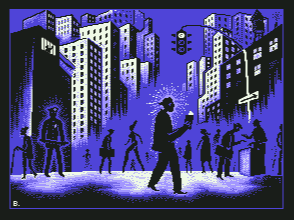
Sorry to say, I pretty much agree on what Sander said. Eventhough the ratio has been adjusted and the characteristics of the C64 pixels and graphic format adds something, there is little beyond the aspects of what the media has to offer that brings something extraordinary to this image. I am not saying that a rip is bad, but at least leave something of your own mark! (and not just some sign in the left corner...) If this happens to be a great hand made conversion, and not just some routine based conversion then we are definately talking... But then the problem still would be that the picture is hardly based on your own source, now is it?
You have made some other pictures in the past that looked ok. Develop that. |
User Comment
Submitted by Sander on 22 December 2006
| Looks good. But it's a plain conversion, with no added value compared to the original piece. |
User Comment
Submitted by Hate Bush on 21 December 2006
| this is good. this is really good. atmospheric shit. would look great as an LP cover. |
User Comment
Submitted by Intensity on 19 December 2006
Great Picture! Loveley! :)
|
User Comment
Submitted by leonofsgr on 18 December 2006
| cooool oldstyle feeling... |
User Comment
Submitted by Jammer on 18 December 2006
| eye pleasing clipart style. good job, keep goin' dude :) |
User Comment
Submitted by MRT on 18 December 2006
User Comment
Submitted by Radiant on 18 December 2006
| Sigh. Now I'll have to re-evaluate this as a conversion piece. Note to graphicians: State if your work is a copy of somebody elses, it makes it easer to judge it fairly. |
User Comment
Submitted by Hoild on 18 December 2006
A real mood-piece copy.
At least it doesn't look like a wire-job. |
User Comment
Submitted by Style on 18 December 2006
| Shame its a copy really :( |
User Comment
Submitted by Jon on 18 December 2006
| I totally dig this, although it isn't an original piece. I love the urbanality (is that a word?)and the conversion to the C64 is top notch. Awesome. Thanks for this. |
User Comment
Submitted by Luca on 17 December 2006
User Comment
Submitted by Radiant on 17 December 2006
| I absolutely love the buildings in the background. IMO the foreground could've been skipped entirely. |
User Comment
Submitted by Skate on 17 December 2006
| Great picture. I'm just disturbed from the incorrect perspective of the buildings which was probably done deliberately. |
User Comment
Submitted by Scout on 17 December 2006
Nice one. Well done!
I bet the next one in the series is called "Police Brutality" ;-) |
User Comment
Submitted by MRT on 17 December 2006
Hey cool. I see rudolph in the top-floor jailhouse!
Cool pic, but too bad of the interlace. You could prolly do it in afli or ufli. |
User Comment
Submitted by Tao on 17 December 2006
| I like it! You really have a style of your own. |
|
|
|
 | Search CSDb |
|
 | Navigate |  |
|
 | Detailed Info |  |
|
 | Fun Stuff |  |
· Goofs
· Hidden Parts
· Trivia
|
|
 | Forum |  |
|
 | Support CSDb |  |
|
 |  |
|


