|
| |
Credits :
Download :
Look for downloads on external sites:
Pokefinder.org
User Comment
Submitted by ptoing on 20 February 2007
| Haha, wec. I guess in that case it's more like a case of *can not* |
User Comment
Submitted by Jak T Rip on 9 January 2007
User Comment
Submitted by jailbird on 21 December 2006
| On a second thought, I don't like it. This picture would look better if it was drawn by me, and there would be a bitchy chick, a horse or a windmill on it, preferably in some graphics mode I like more than this one. And unlike you, I'd finish the picture. Like, where is the background, man? |
User Comment
Submitted by Oswald on 21 December 2006
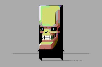
DK: also skeletons dont look like that.
(back in the day there were many skeletons in my window so I can tell ) |
User Comment
Submitted by DeeKay on 21 December 2006
Interesting, but it doesn't really click with me. I just don't like the coloring somehow, I think this could've been better with less colors (gosh, never thought *I* would ever say this! ;-)
Hooray for AFLI though (my favourite Mode besides U(I)FLI), although that picture's screen area looks like it's almost perfectly suited for SH(I)F, some extra spritelayers can work wonders... |
User Comment
Submitted by leonofsgr on 20 December 2006
User Comment
Submitted by stash on 20 December 2006
dont know why but this
somehow reminds me of zack mc kracken
|
User Comment
Submitted by Jucke on 20 December 2006
| Nice and interesting. I like it. |
User Comment
Submitted by ptoing on 20 December 2006
User Comment
Submitted by TDJ on 20 December 2006
| Ptoing man, that must suck, if no-one at all likes your work :( |
User Comment
Submitted by noone_at_all on 20 December 2006
ptoing rules.
not just good pictures nice to look at-> this is warhol! this is ART! |
User Comment
Submitted by AMB on 20 December 2006
| I dont´t know a lot about GFX techniques, but I know what I like and this one is very nice! :) |
User Comment
Submitted by Tao on 20 December 2006
| Awesome! Another Ptoing masterpiece to rock the world. |
User Comment
Submitted by Oswald on 20 December 2006
User Comment
Submitted by oys on 20 December 2006
User Comment
Submitted by Radiant on 20 December 2006
| It's cool to see more AFLI pictures, as it's a quite capable yet cumbersome format. I had hoped for more from the awesome hands of Ptoing though, but it's definitely ok++ for a test picture, even if the format isn't exploited to its maximum. :-) |
User Comment
Submitted by ptoing on 20 December 2006
@Deev: Sometimes a bit negative space is nice, imo. Plus this was just a quick testpicture to get a general feel for AFLI.
@Stainless Steel: No problem, nothing spoiled :)
@hannez: You are entitled to your opinion and not liking the piece, but I would be glad if I can do what I want to. I am enjoying exploring new modes and there will be more stuff from me in different modes to come. There will be however more hires pictures as well. Watch out for the 2nd Red Brand demo from now :P
|
User Comment
Submitted by hannenz on 20 December 2006
| please ptoing - stay with your very cool HiRes Style and give us more of those - i am sorry but this one looks simply ugly, unfinished and has no style. your hires pics are so f**ing cool but this one doesn't rock at all. |
User Comment
Submitted by jailbird on 20 December 2006
| Love the style, Ptoing for pixel-president! \:D/ |
User Comment
Submitted by Skate on 20 December 2006
| Another interesting work from Ptoing. I liked it. |
User Comment
Submitted by Stainless Steel on 20 December 2006
dont like it. might be my preference for multicolor gfx. its just not my thing, sorry if i spoiled your day.
|
User Comment
Submitted by TDJ on 20 December 2006
User Comment
Submitted by A Life in Hell on 20 December 2006
| afli is the way of the future! |
User Comment
Submitted by Mermaid on 20 December 2006
| Lovely! :) Just goes to show you don't always *need* a fancy background, you don't *have* to fill out every single bit of the screen (or paper, or canvas) with stuff. |
User Comment
Submitted by Deev on 20 December 2006
| it looks a little sparse, without any sort of background, but what's there is very nice! |
|
|
|
 | Search CSDb |
|
 | Navigate |  |
|
 | Detailed Info |  |
|
 | Fun Stuff |  |
· Goofs
· Hidden Parts
· Trivia
|
|
 | Forum |  |
|
 | Support CSDb |  |
|
 |  |
|


