|
| |
|
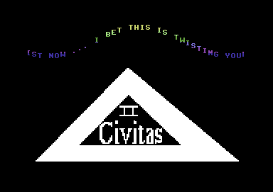
Triangle of Code II [2008] |
Credits :
| Code | .... | Richard of Blazon, Civitas, People of Liberty, Psytronik Software, Scene World Magazine, The New Dimension |
| Music | .... | Randy of Fatum |
| Graphics | .... | Richard of Blazon, Civitas, People of Liberty, Psytronik Software, Scene World Magazine, The New Dimension |
| Idea | .... | Richard of Blazon, Civitas, People of Liberty, Psytronik Software, Scene World Magazine, The New Dimension |
| Text | .... | Richard of Blazon, Civitas, People of Liberty, Psytronik Software, Scene World Magazine, The New Dimension |
SIDs used in this release :
Download :
Look for downloads on external sites:
Pokefinder.org
User Comment
Submitted by markus sinalco on 17 March 2008
| eVen b3tehr than part oHne and my 0ld intro5 ! |
User Comment
Submitted by Stainless Steel on 16 March 2008
User Comment
Submitted by Tim on 16 March 2008
| @fade yes, but only if you run out of newspaper.. the inkt from the news gives it extra flavour! |
User Comment
Submitted by The Overkiller on 16 March 2008
| Argh I love dycp effect. Richard why you didn't code it in the past for an HF intro ? |
User Comment
Submitted by Joe on 15 March 2008
| OMG: This is one of the funniest geometric shapes I've ever seen! Here is one, which is very beautiful. |
User Comment
Submitted by fade on 15 March 2008
| not allowed to wrap fish n chips in paper anymore :/ |
User Comment
Submitted by Tim on 15 March 2008
yeah hence i asked why?
Coz the sucky gfx almost ruined it for me.. I watched it in the end and was supprised actually by some effects i haven't seen in a while.
Richard please please please, i've said this before.. (and i'll probably say it again) spend a bit more time on quality before releasing stuff! It's like xmas.. gifts are worth wrapping up in nice paper.. not in yesterdays newspaper which should only be used for fish-n-chips!
|
User Comment
Submitted by A Life in Hell on 15 March 2008
a conversion tool would obviously use more than one color on the logo in multicolour mode :-p.
Seriously, though, I personally think this is pretty cool. Yeah, it's simple, and yeah, the logo sucks, but otherwise it's pretty well put together, and the music goes well with it. |
User Comment
Submitted by Skate on 14 March 2008
Triangle and logo are bad, I agree. Scroll routine is completely ok, specially for a first try.
I felt that Richard is satisfied with his achivement. No dude, you shouldn't feel easy unless you make 16 ORA DYCPs (or 3 of them in 256 bytes) :) |
User Comment
Submitted by fade on 14 March 2008
I'm going hunting for 64's this morning, i think i might bail that and hunt a dtv instead. or perhaps a spectrum or better yet a vic20 even though i hate that fucking huge font and those aids looking cartridges. amstrad or die!
Edit: Now, i've actually watched this, it's not so bad. but yeah that triangle is a bother, i was hoping for a dy(whatever the tech name is for when the font flips vertically in a dysp) .. Richard mah boi break the borders, dycps are sexy in the border. They also prove you haver a huge wanger. Tune reminds me of the stuff in the mid 90's like bbe - til i come etc etc.. Glad it isnt a fake release to be honest. |
User Comment
Submitted by Danzig on 14 March 2008
| none of you nerds identify a lame connect 3 lines in paint magic flood fill at first spot? or better, this is my guess what it is :D |
User Comment
Submitted by gregg on 14 March 2008
@Bordeaux:
That's also what came to my mind quickly. The triangle is all wrong, and the logo doesn't look any good either. Probably a bad conversion. |
User Comment
Submitted by Tim on 14 March 2008
Why was this released on the civitas lable? just curious.
Oh and I just wanted to mention that the triangle has multiple errors. To be honnest I was a bit supprised to see that, since it's such a simple shape there's not really much you could do wrong even if it was done intentionally. Is it an x-ferred pic? |
User Comment
Submitted by Ed on 14 March 2008
|
|
|
 | Search CSDb |
|
 | Navigate |  |
|
 | Detailed Info |  |
|
 | Fun Stuff |  |
· Goofs
· Hidden Parts
· Trivia
|
|
 | Forum |  |
|
 | Support CSDb |  |
|
 |  |
|


