|
| |
 |
Released by :
JSL
Release Date :
26 June 2009
Type :
C64 Graphics
(MultiColor)
|
Credits :
Download :
Look for downloads on external sites:
Pokefinder.org
User Comment
Submitted by null on 1 July 2009
| I like this a lot. :_) stick with this style, it kicks ass. |
User Comment
Submitted by GT on 30 June 2009
User Comment
Submitted by Jucke on 30 June 2009
| jailbird? i am waiting for the cover.. (: |
User Comment
Submitted by Tim on 27 June 2009
@Motion
oh yeah.. money for nothing!!! /me airguitars on the melody in his head :P
But you're right, it's somewhat similar.. although I'd still say it's a great idea/execution by JSL |
User Comment
Submitted by Moloch on 27 June 2009
User Comment
Submitted by Motion on 27 June 2009
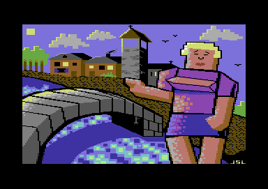
I do like this, but not as much as Vectortown 1, reminds me of Money F'Nothin. Love the water and the torso's reflective light shading.
|
User Comment
Submitted by Ksubi on 26 June 2009
| Great work JSL. Love this new style! Feels fresh and original. |
User Comment
Submitted by leonofsgr on 26 June 2009
| wow! new design and style! thumbs up! great work dude! |
User Comment
Submitted by Tim on 26 June 2009
@stainless ditto.. lights are on and the sun is up ;)
@JSL does the bridge center intentionally go down a bit in the center? (so not a full curve, nor a straight top)
Rating: 7/10 for me (well 6.5, but since i pushed vectortown 1 down by 0,5 in voting i'll put this one up)
Thumbs up!
ps, sun needs improvement or i demand a complete grey square/cicle as moon next pic :P |
User Comment
Submitted by Stainless Steel on 26 June 2009
Yay love the surreal perspective, dithering and the general new style of JSL. Thumbs up, Johan.
Not sure if it's supposed to be day or night though.
|
User Comment
Submitted by DRAX on 26 June 2009
User Comment
Submitted by Oswald on 26 June 2009
| wow, jsl found his style! |
User Comment
Submitted by Jok on 26 June 2009
| interesting, fresh, but many details (+ground texture) looks ugly |
User Comment
Submitted by linde on 26 June 2009
User Comment
Submitted by Joe on 26 June 2009
Not bad at all.
Based on the golden ratio or the Fibonacci spiral. The geometry fit properly in both pictures.
JSL hides the divine cleverly by maybe adding a few too many elements in his images. |
User Comment
Submitted by Hoild on 26 June 2009
| The buildings, trees, clouds and water texture is actually good, like 'em! The rest suxx, though. |
User Comment
Submitted by Frantic on 26 June 2009
| ...this was more of a "vector town" though. Vector tits! Very data-sexy! |
|
|
|
 | Search CSDb |
|
 | Navigate |  |
|
 | Detailed Info |  |
|
 | Fun Stuff |  |
· Goofs
· Hidden Parts
· Trivia
|
|
 | Forum |  |
|
 | Support CSDb |  |
|
 |  |
|


