|
| |
Released At :
Silesia Party 3
Achievements :
C64 Graphics Competition at Silesia Party 3 : #1
Credits :
Download :
Look for downloads on external sites:
Pokefinder.org
User Comment
Submitted by Jak T Rip on 19 October 2009
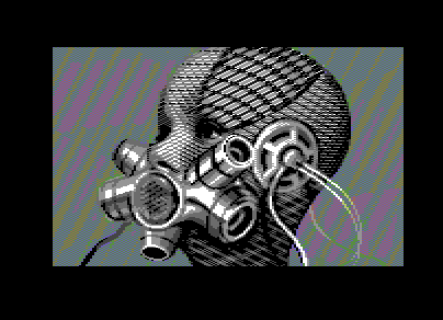
| Joe, surprising and disturbing as ever. Brilliant. |
User Comment
Submitted by oys on 23 September 2009
| looks very nice but they get abit boring, also seems unfinished at some places i think. |
User Comment
Submitted by DeeKay on 23 September 2009
| I just love what Joe does time and again with patterns, how he re-invents the concept of dithering in pretty much every single picture. I can't let go of my beloved combined floyd/checkerboard method, but Joe shows us there's still SO much that hasn't been tried yet i feel intrigued to find out what new methods of dithering NUFLI brings to the table! ;-) |
User Comment
Submitted by booker on 22 September 2009
Ahh, Joe. Too bad you weren't there to hear the audience, and believe me, there wasn't much noise from the audience at the competitions (comparing to Western parties) except your pic :).
Grab your bro and jump in next year! :) |
User Comment
Submitted by irwin on 21 September 2009
| C64 has only 16 color palette? Not in this picture ;) Amazing dither. 1st place and 10,5/10 ;) |
User Comment
Submitted by yago on 21 September 2009
| The Poles yelled and screamed, just like when the Vandalism#51 Intro was shown... |
User Comment
Submitted by NecroPolo on 21 September 2009
Man, if I was a graphician, I'd respect and hate you sooo much for your unique style... :P ;)
Top-notch work, the best on the party. C'grats for #1! Totally deserved, you have stolen the show! |
User Comment
Submitted by nada on 21 September 2009
| mind - blowwwwing !! thank You, joe * :) :) |
User Comment
Submitted by Archmage on 21 September 2009
| Definetly one of your better ones, Joe. Nice! |
User Comment
Submitted by Tao on 21 September 2009
User Comment
Submitted by FATFrost on 20 September 2009
| well joe, once again you deliver amazing pixels and colour scheme. now i think you should start working in the movie industry to bring all the works to life! Well done! |
User Comment
Submitted by comankh on 20 September 2009
| purrfect. too bad that party beamer messed all the dithering. same goes to other releases from this party. |
User Comment
Submitted by Jammer on 20 September 2009
| excellence unconditioned by any personal tastes, it's objectively perfect! |
User Comment
Submitted by Jon on 20 September 2009
User Comment
Submitted by leonofsgr on 20 September 2009
User Comment
Submitted by SIDWAVE on 20 September 2009
This is the new trend in BDSM ?
Straight 9! if you want 10, then use more different colors. |
User Comment
Submitted by Hoild on 20 September 2009
| Good idea with the colourful streaks in the background, it gives contrast to the monochrome center piece and makes the picture more interesting to look at. |
User Comment
Submitted by Alias Medron on 20 September 2009
Great stuff!
9 from me (just because i know you can do even better :) |
User Comment
Submitted by Street Tuff on 20 September 2009
User Comment
Submitted by Celtic on 20 September 2009
User Comment
Submitted by Mermaid on 20 September 2009
| Awesome stuff Joe, I love it <3 |
User Comment
Submitted by Skate on 20 September 2009
| pattern art! great style. |
|
|
|
 | Search CSDb |
|
 | Navigate |  |
|
 | Detailed Info |  |
|
 | Fun Stuff |  |
· Goofs (1)
· Hidden Parts
· Trivia
|
|
 | Forum |  |
|
 | Support CSDb |  |
|
 |  |
|


