|
| |
Released At :
Datastorm 2010
Achievements :
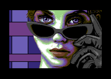
C64 Graphics Competition at Datastorm 2010 : #1
Credits :
Download :
Look for downloads on external sites:
Pokefinder.org
User Comment
Submitted by Jak T Rip on 15 July 2011
User Comment
Submitted by daison on 9 February 2010
User Comment
Submitted by Edhellon on 8 February 2010
| Yes, the background and the black of the sunglasses feels a bit unfinished indeed. Having said that, the composition, pixeling, etc. etc. are all top notch here. I really like this one! |
User Comment
Submitted by ne7 on 8 February 2010
| : ) looks a lot like jennifer connelly which is no bad thing <3 bloody nice pic - was nice meeting u at the party too :) |
User Comment
Submitted by leonofsgr on 8 February 2010
| yeah! great pix! like the eyes! \o/ congrat! |
User Comment
Submitted by Ksubi on 8 February 2010
| Great work! Love the colours and the overall feel. The glasses however give the impression that they have no lenses in them, instead they look too dense to let light in. Excellent work overall and a deserved winner. |
User Comment
Submitted by Magnar on 7 February 2010
| Lovely face and gloves. But the sunglasses and the (empty) background seems unfinished. First impression is however very astonishing! Gives a nice 1980's vibes :) Cheers, Magnar |
User Comment
Submitted by Oswald on 7 February 2010
| perfect in all aspects, grabs my eyes and just cant get them go. |
User Comment
Submitted by wacek on 7 February 2010
| Now I want to say this is very "80s" styled, but not in "C64 80s graphics style" ;) Thumbs up! |
User Comment
Submitted by PAL on 7 February 2010
| ohhhh... like Joe said, the best imaginable format for me too and a nice image and comp... Great work here! The glove is super cool! |
User Comment
Submitted by FATFrost on 7 February 2010
User Comment
Submitted by v3to on 7 February 2010
| malmix i like this one. thumbs up :) |
User Comment
Submitted by Radiant on 7 February 2010
| The clear compo winner. Malmix keeps getting better! |
User Comment
Submitted by Joe on 7 February 2010
| Way to go! I'd use less white myself, but the cutout is great! Thank you for using my favorite gfx-mode. |
|
|
|
 | Search CSDb |
|
 | Navigate |  |
|
 | Detailed Info |  |
|
 | Fun Stuff |  |
· Goofs
· Hidden Parts
· Trivia
|
|
 | Forum |  |
|
 | Support CSDb |  |
|
 |  |
|


