|
| |
Released At :
Silesia Party 5
Achievements :
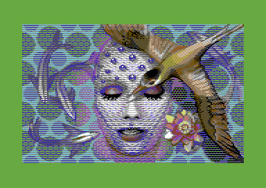
C64 Graphics Competition at Silesia Party 5 : #2
Credits :
Download :
Look for downloads on external sites:
Pokefinder.org
User Comment
Submitted by rail slave on 1 June 2021
User Comment
Submitted by NecroPolo on 4 June 2013
| Standing ovations from me. It is beyond imagination what is done with MC mode here. |
User Comment
Submitted by Jak T Rip on 17 December 2011
| Fantastic. Another highly demanding piece from Joe. the way you bring in different layers or even dimensions into pictures is somewhat unbelievable. And the picture looks so easy, as if it was nothing to add these colours here and these details there. Kotau! |
User Comment
Submitted by BHF on 27 October 2011
A very good picture indeed :)
I like your style, wonder how you do it ! |
User Comment
Submitted by Clarence on 27 October 2011
| Impressive pic again, that bird looks freaking awesome. |
User Comment
Submitted by Joe on 26 October 2011
| Oh! Check the workstages. They were intended from the beginning. That first sketch is far better than the endresult in a way, it holds a greater depth. However, as usual people get the easy train onto what served as pixeled parts. Mine is not, it is manufactured periods of transitions. |
User Comment
Submitted by Oswald on 26 October 2011
| I think Sander ment the face and bird, they're obvious crowdpleasers :) |
User Comment
Submitted by Joe on 26 October 2011
Winner ingredients? Well, for one I've continued the search for none-dithering along with simple tiling, although the bird is very much crosshatched and very much the result of... Pixels.
I have one more image left for the series and a fifth for Hedning. This one didn't turn out as good as I wanted, but I'm glad about the votes. Clone recently became active again, and I'm glad I can say it's my background over there :). |
User Comment
Submitted by Sander on 26 October 2011
| Fantastic! Now when are you gonna drop the 'winner-ingredients'? You don't need those :) |
User Comment
Submitted by celticdesign on 25 October 2011
User Comment
Submitted by Yogibear on 25 October 2011
| Contains some neat stuff! |
User Comment
Submitted by Brush on 25 October 2011
User Comment
Submitted by Edhellon on 24 October 2011
Unbelievable. It seems multicolour restrictions don't exist for some people. :)
Oh, and really, what Oswald said about not having to explain limitations, this is art pure and simple. The fact that it's a standard C64 multicolour picture just makes it even more amazing in my nerdy eyes. Thank you Joe! |
User Comment
Submitted by Wile Coyote on 24 October 2011
I like this more than Shatter.
The texture reminds me of cotton material.
EDIT: I think I would like the image more if the bird wasn't there. Staying with the cotton theme, maybe the flower could match the style of the background. I think the whole purpose of the background is to represent water, thus the bird and flower are deliberately drawn using a different style. |
User Comment
Submitted by hedning on 24 October 2011
User Comment
Submitted by aNdy on 23 October 2011
| Beautiful, almost Amiga like. |
User Comment
Submitted by Viscid on 23 October 2011
| Wonderful picture with great colours... |
User Comment
Submitted by Oswald on 23 October 2011
| Joe, you make us all proud c64 owners, we can show this to anyone without having to explain about limitations, etc. Art. |
User Comment
Submitted by G-Fellow on 23 October 2011
User Comment
Submitted by crayon on 23 October 2011
User Comment
Submitted by Tao on 23 October 2011
I didn't even have to think twice. Straight 10.
Excellent work Joe! |
User Comment
Submitted by Sledge on 23 October 2011
| You have found your style, and this is in my eyes the best pic so far! Great stuff! |
User Comment
Submitted by leonofsgr on 23 October 2011
| more air! more air! plz plz plz! \o/ |
User Comment
Submitted by Isildur on 23 October 2011
|
|
|
 | Search CSDb |
|
 | Navigate |  |
|
 | Detailed Info |  |
|
 | Fun Stuff |  |
· Goofs
· Hidden Parts
· Trivia
|
|
 | Forum |  |
|
 | Support CSDb |  |
|
 |  |
|


