|
| |
Credits :
| Code | .... | TWW of Creators |
| Music | .... | Jeff of Bonzai, Camelot, Cosine, Crest, Viruz |
| Graphics | .... | JSL of Covenant, Raiders of the Lost Empire, Tropyx |
| Design | .... | JSL of Covenant, Raiders of the Lost Empire, Tropyx |
| Idea | .... | JSL of Covenant, Raiders of the Lost Empire, Tropyx |
| Text | .... | JSL of Covenant, Raiders of the Lost Empire, Tropyx |
| | | TWW of Creators |
| Charset | .... | TWW of Creators |
| Concept | .... | JSL of Covenant, Raiders of the Lost Empire, Tropyx |
SIDs used in this release :
Download :
Look for downloads on external sites:
Pokefinder.org
User Comment
Submitted by Jak T Rip on 26 February 2012
| Cool to see some TWW action again and one of the best pictures ever from JSL! |
User Comment
Submitted by Lobogris on 20 February 2012
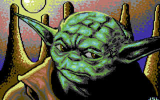
Nice painting of Yoda! (best watched in emu or real c64 than the snapshot) I don't like much background, it's clearly painted in another style...
Good job ;) |
User Comment
Submitted by Mr Wegi on 20 February 2012
User Comment
Submitted by Jok on 20 February 2012
| Yoda looks quite nice! -but mountains are too repetitive and black outline around sun doesnt work imho |
User Comment
Submitted by The Shadow on 20 February 2012
| With practice comes growth. The skills of JSL have been evolving well over the last few years. This demo is a work of art! Yoda looks absolutely awesome. |
User Comment
Submitted by Moloch on 20 February 2012
The Yoda head shape is not correct and the nose is flat, otherwise good job. Like the rendition of the ears.
Really like the background, especially the blotchy fill pattern. |
User Comment
Submitted by TheRyk on 19 February 2012
| Typical JSL black outline dithering - often rightly criticized - works very well here :) Very nice! |
User Comment
Submitted by Yogibear on 19 February 2012
User Comment
Submitted by Raffox|HF on 19 February 2012
| Main character is nicely done, backgorund dithering has a good effect. Shadows are correctly displaced. I like it. |
User Comment
Submitted by Elder0010 on 19 February 2012
User Comment
Submitted by Yazoo on 19 February 2012
| my favourite jsl picture so far |
User Comment
Submitted by Dr.j on 19 February 2012
| Very good picture. very high skills |
User Comment
Submitted by hedning on 19 February 2012
User Comment
Submitted by Sledge on 19 February 2012
| This one is really good. Nice presentation :) |
User Comment
Submitted by Steppe on 19 February 2012
| Bloody nice pic, JSL! You seriously improved your pixelling skills, I especially dig those "sloppy" colour transitions! |
User Comment
Submitted by Rough on 19 February 2012
| Yoda himself is very well done. But the background sucks. A pity. |
User Comment
Submitted by JSL on 19 February 2012
short one-file demo presenting my picture YODA, with little Star Wars Intro, with scroller.. Thanks TWW/Creators for putting this together! :))
|
|
|
|
 | Search CSDb |
|
 | Navigate |  |
|
 | Detailed Info |  |
|
 | Fun Stuff |  |
· Goofs
· Hidden Parts
· Trivia
|
|
 | Forum |  |
|
 | Support CSDb |  |
|
 |  |
|


