|
| |
|
Avatar Intro (Nouveau Monochrome) [2013] |
Credits :
SIDs used in this release :
Cracks which use this intro :
Download :
Look for downloads on external sites:
Pokefinder.org
User Comment
Submitted by BokanoiD on 1 October 2013
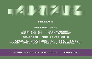
| Nice classic intro. And very nice logo! |
User Comment
Submitted by Xiny6581 on 30 September 2013
| I like this! It feels modern, yet stylish with that extra thaaaa, which makes it cool! |
User Comment
Submitted by Shine on 30 September 2013
User Comment
Submitted by Dr.j on 30 September 2013
| Nice intro. love the (old?) font , classic font style |
User Comment
Submitted by bepp on 29 September 2013
User Comment
Submitted by The Shadow on 29 September 2013
| Yeah, the color tables seem to be located in the memory of just beyond where the scroller is. Adding a longer scroll in the crack release intro altered the colors where the color table was. The new colors add a nice effect. Depending upon how you stare at the scroll, it will appear jittery or very cool. As a result, the new colors were kept for the crack release. |
User Comment
Submitted by iAN CooG on 29 September 2013
too bad the release has a wrong color pattern in the scroller
edit: this was not done with minimal memory fingerprint in mind, there are large unused areas for nothing, and the scroller color table put right after the small scroll text only calls for problems, which inevitably happened in the actual release.
TheRyk: no, it wasn't intended, just the col table put at wrong address, so it reads the scrolltext as colors =) |
User Comment
Submitted by TheRyk on 29 September 2013
Awesome logo! Only side border sprites could have enhanced it.
Edit: but +1@ what Ian said about color pattern in Vampire's release, thought that was intended, but looks a little silly and rather unreadable |
|
|
|
 | Search CSDb |
|
 | Navigate |  |
|
 | Detailed Info |  |
|
 | Fun Stuff |  |
· Goofs
· Hidden Parts
· Trivia
|
|
 | Forum |  |
|
 | Support CSDb |  |
|
 |  |
|


