|
| |
|
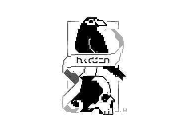
The Stillness and The Shadow [2013] |
Released At :
Plain PETSCII Graphics Competition 2013
Achievements :
C64 Graphics Competition at Plain PETSCII Graphics Competition 2013 : #25
Credits :
Download :
Look for downloads on external sites:
Pokefinder.org
User Comment
Submitted by Jak T Rip on 15 October 2013
| Great, as usual. My anatomy skills are really bad, I would have thought the heart would go somewhere else. |
User Comment
Submitted by redcrab on 13 October 2013
| This is great! Good both designwise and technically. The only thing I'd done differently is grey instead of black for the shade of the skull, but hey I really like it this way too :) The heart and the , and ; are very well put btw. |
User Comment
Submitted by Motion on 13 October 2013
| Very classy. I like it lots. |
User Comment
Submitted by Mermaid on 12 October 2013
| This is so clean and stylish, I absolutely love it <3 |
User Comment
Submitted by Kordiaukis on 12 October 2013
| nice one .. waiting for more . |
User Comment
Submitted by The Shadow on 12 October 2013
| Great pic and great name :) |
User Comment
Submitted by Shine on 12 October 2013
| Nice idea and execution! :) |
User Comment
Submitted by Rough on 12 October 2013
| Yes. Very nice, hard to believe it's done with Commodore chars only. |
User Comment
Submitted by TheRyk on 12 October 2013
Very nice one!
@wacek: I can assure you that releases like The Call from Beneath belong to the rennaissance of PETSCII in my view. Great to have you in the competition. |
User Comment
Submitted by bepp on 12 October 2013
User Comment
Submitted by hedning on 12 October 2013
User Comment
Submitted by Doc Strange on 12 October 2013
| Really stylish and elegant. |
User Comment
Submitted by Hammerfist on 12 October 2013
| Nevertheless, this is a stylish and well executed logo! I had to look close to see how parts of it were made, with what characters. That's awesome! |
User Comment
Submitted by wacek on 12 October 2013
I cannot beat the amazing artworks from the 'real' graphicians, so I'm not even going to try ;) On a sidenote, I am very pleased that PETSCII is making a comeback, hopefully some of my recent releases to some degree contributed to that wave :)
In the meantime, enjoy this simple creation. |
|
|
|
 | Search CSDb |
|
 | Navigate |  |
|
 | Detailed Info |  |
|
 | Fun Stuff |  |
· Goofs
· Hidden Parts
· Trivia
|
|
 | Forum |  |
|
 | Support CSDb |  |
|
 |  |
|


