|
| |
 |
Released by :
JSL
Release Date :
24 November 2013
Type :
C64 Graphics
(MultiColor)
|
Credits :
Download :
Look for downloads on external sites:
Pokefinder.org
User Comment
Submitted by celticdesign on 10 April 2015
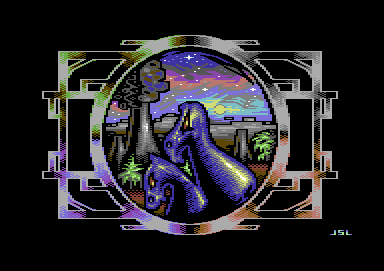
| One of his best pics for. |
User Comment
Submitted by Jak T Rip on 8 December 2013
| This must be one of the most beautiful skies ever. |
User Comment
Submitted by Yogibear on 3 December 2013
User Comment
Submitted by slimeysmine on 27 November 2013
Not the usual JSL style imo (not a bad thing either :))
I think the pixel work is spot on. Nice to see you trying new ideas JSL :) |
User Comment
Submitted by aNdy on 25 November 2013
| The outside is nicer than the inside. If you see what I mean. |
User Comment
Submitted by Slator on 25 November 2013
| nice work, frame and sky are really top notch, the two blue somethings are a little hm, not my cup of tea but all in all a really good picture. |
User Comment
Submitted by Dr.j on 25 November 2013
| Very nice but the two head dragons or what ever it is, are less nicer |
User Comment
Submitted by AüMTRöN on 24 November 2013
Pic is superb until the photobombing blue seahorses show up... those kinda spoil it a bit...
Sky in particular is very nice. |
User Comment
Submitted by Hammerfist on 24 November 2013
| The frame reminds me of the Amiga demo Global Trash. The sky is nice indeed, the dragon I don't like so much. |
User Comment
Submitted by JSL on 24 November 2013
Maybe this picture is influenced by my "Mansion" from some years ago, same circle graphic, and design around it..
See: Mansion |
User Comment
Submitted by The Shadow on 24 November 2013
User Comment
Submitted by hedning on 24 November 2013
| Yeah. Frame and sky is indeed really good. |
User Comment
Submitted by Mermaid on 24 November 2013
| I like the frame and the sky, nice. |
User Comment
Submitted by TheRyk on 24 November 2013
| Backround and stuff is really great, esp colors. motive is so-so, not my cup of tea, reminds me mor of two blue horse. Still a good one, all in all. |
User Comment
Submitted by JSL on 24 November 2013
| Gary is Green.. This is some weird Pixel idea I had.. |
User Comment
Submitted by Fierman on 24 November 2013
User Comment
Submitted by JSL on 24 November 2013
| Should be a Two-headed Dragon, not to be mixed with Cerberus, the Three-Headed Dog.. Strange design.. Three colors, copied to four places.. Enjoy.. Or not.. |
|
|
|
 | Search CSDb |
|
 | Navigate |  |
|
 | Detailed Info |  |
|
 | Fun Stuff |  |
· Goofs
· Hidden Parts
· Trivia
|
|
 | Forum |  |
|
 | Support CSDb |  |
|
 |  |
|


