|
| |
|
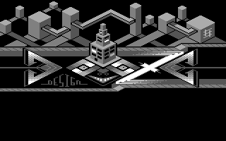
Booze Design Logo "IsoOze" [2014] |
Credits :
Download :
Look for downloads on external sites:
Pokefinder.org
User Comment
Submitted by Joe on 9 April 2014
| Finally taking the joy of exploring details in small scale! Dont forget those subtle shadows then, from top left to lower right. Thankfully you start to break up symmetry. Its still constituted with the central object in the bottom. |
User Comment
Submitted by Shine on 1 April 2014
| THANK YOU guys for the nice feedback so far! That makes me very happy. :) |
User Comment
Submitted by spider-j on 1 April 2014
| JSR: it's about 10 screens too small for that ;-) |
User Comment
Submitted by HCL on 1 April 2014
| Omg, i missed this one! Cool with the geometrics, and i especially like the shadows from the buildings :). |
User Comment
Submitted by Jak T Rip on 1 April 2014
| Requires an Offence/Prosonix/Flt style effect around it :) |
User Comment
Submitted by Dr.j on 27 March 2014
| Interesting! good job Andy :-) |
User Comment
Submitted by dink on 27 March 2014
| I like this one, and the curly one. |
User Comment
Submitted by TheRyk on 27 March 2014
| I think here the mystery idea justifies that it's not readably at first glance. Good stuff. Much better than the last one. |
User Comment
Submitted by Didi on 27 March 2014
| Nearly unreadable but cool. |
User Comment
Submitted by Yogibear on 27 March 2014
|
|
|
 | Search CSDb |
|
 | Navigate |  |
|
 | Detailed Info |  |
|
 | Fun Stuff |  |
· Goofs
· Hidden Parts
· Trivia
|
|
 | Forum |  |
|
 | Support CSDb |  |
|
 |  |
|


