|
| |
Released At :
RetroKomp/LOAD ERROR 2015
Achievements :
Mixed Graphics Competition at RetroKomp/LOAD ERROR 2015 : #7
Credits :
Download :
Look for downloads on external sites:
Pokefinder.org
User Comment
Submitted by Zoolon on 21 October 2015
User Comment
Submitted by DKT on 19 October 2015
What are you all talking about?
The light work, the shadows... It's brilliant!
Imperfection in art makes it an art (specially on C64 using HiRes ;) ). |
User Comment
Submitted by Dr.j on 19 October 2015
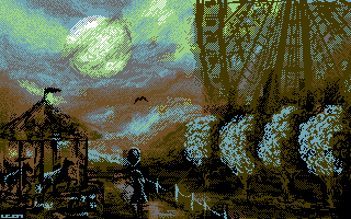
| i love the gloomy atmosphere Leon but one note i beg your pardon mate but the baloon misplaced the head i think , they (the objects) are very resemble and a bit Interfering the overall scene. but in overall its a fine sketch |
User Comment
Submitted by jailbird on 19 October 2015
Quoting oswaldthank csdb for registering a doubleclick on the submit as two comments posted, and not being able to delete it to stay here forever with this one :) Stop blaming CSDb for youre own lameness. This shitplace is simpli amzaing and teh no edit your comment after you sumbit is the bestest fiature! |
User Comment
Submitted by Jak T Rip on 19 October 2015
| Great one. The perspective is askew at times, but probably that even adds up to the strange, loomy atmosphere. Great lightning! |
User Comment
Submitted by Joe on 18 October 2015
User Comment
Submitted by Oswald on 18 October 2015
| thank csdb for registering a doubleclick on the submit as two comments posted, and not being able to delete it to stay here forever with this one :) |
User Comment
Submitted by Oswald on 18 October 2015
| the fuzzynes works finally, excellent picture overall. however hoild has points with the perspective, still a great picture. |
User Comment
Submitted by Oswald on 18 October 2015
| the fuzzynes works finally, excellent picture overall. however hoild has points with the perspective, still a great picture. |
User Comment
Submitted by GeoAnas on 18 October 2015
| Excellent picture...as usual! |
User Comment
Submitted by Hoild on 18 October 2015
| I like that it is a drawn graphics rather than a converted photo. Leon's unusual choice of palette lends it a strong mood. However and as quite usual with his drawn graphics, the perspective is off -- check the trees vs. the wheel vs. the roundabout. Also, the balloon (I assume it is one) displaces the woman's head in such a way that it seems to be her out-of-proportion head. Overall I still like it. |
User Comment
Submitted by Shine on 18 October 2015
User Comment
Submitted by nice on 18 October 2015
| This one doesn't undertake too much, but solves it perfectly. The wheel and the moon are especially impressive. |
|
|
|
 | Search CSDb |
|
 | Navigate |  |
|
 | Detailed Info |  |
|
 | Fun Stuff |  |
· Goofs
· Hidden Parts
· Trivia
|
|
 | Forum |  |
|
 | Support CSDb |  |
|
 |  |
|


