|
| |
|
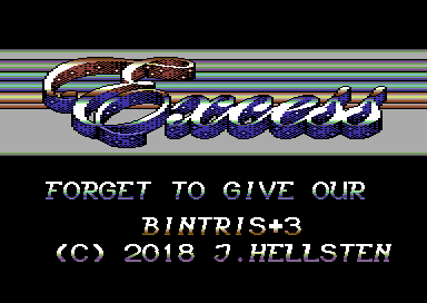
Excess Intro by Kickback [2018] |
Credits :
SIDs used in this release :
Cracks which use this intro :
Download :
Look for downloads on external sites:
Pokefinder.org
User Comment
Submitted by HCL on 11 July 2023
User Comment
Submitted by TheRyk on 25 May 2018
| great logo, raster bars could need some speed to fit a little better to the wonderful beat, altogether very good stuff |
User Comment
Submitted by nucleus on 25 May 2018
User Comment
Submitted by xIII on 25 May 2018
User Comment
Submitted by Dr.j on 24 May 2018
| very cool work +1 for the great logo! |
User Comment
Submitted by Moloch on 24 May 2018
User Comment
Submitted by celticdesign on 24 May 2018
Mey likes. But somehow I miss some fade in and out fx for the intro itself.
Also some little more action (changing color themes of the scroll from time to time, moving logo, different scroll speed...).
Dig the music. Keep'm comin' sir! |
User Comment
Submitted by Knight Rider on 24 May 2018
| use VICE x64SC an C64C PAL |
User Comment
Submitted by Kickback on 24 May 2018
:P
I mean, who can be so active like you! Poster child for CSDB ;) |
User Comment
Submitted by Moloch on 24 May 2018
| omg, kickback did something?! ;) intro looks nice |
User Comment
Submitted by Kickback on 24 May 2018
Aaaah I see you guys used it! As for the grey dots.. I wasn't aware of them, and I did testing, with other dudes as well.
I was using Vice, and tested with PAL/NTSC c64c roms. What should I test with, because I didn't see this with Vice. (Been a LONG time since I did any type of rasters :) ) |
User Comment
Submitted by Compyx on 23 May 2018
Grey dot bugs or no, I like the logo and the fact that black is actually black, not having the raster bars "shine through".
Nice one. |
User Comment
Submitted by Thierry on 23 May 2018
User Comment
Submitted by Scan on 23 May 2018
| Nice intro, but shows grey dot glitch on newer models. This could easily have been avoided by not calling the subroutine at 2a80. |
User Comment
Submitted by chatGPZ on 22 May 2018
| another intro that would have been nice... and is ruined by grey dot flickerfest :( |
User Comment
Submitted by iAN CooG on 22 May 2018
User Comment
Submitted by Didi on 22 May 2018
| I love this logo! Great usage of rasters. Beautiful intro overall. Music is not my taste. |
User Comment
Submitted by iAN CooG on 22 May 2018
|
|
|
 | Search CSDb |
|
 | Navigate |  |
|
 | Detailed Info |  |
|
 | Fun Stuff |  |
· Goofs
· Hidden Parts
· Trivia
|
|
 | Forum |  |
|
 | Support CSDb |  |
|
 |  |
|


