|
| |
AKA :
Giana in Space
Credits :
Download :
Look for downloads on external sites:
Pokefinder.org
User Comment
Submitted by wil on 22 March 2024
Awesome work! Very true to the original: https://www.imdb.com/media/rm3795752960/nm1065454
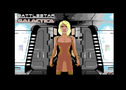
I like the semitransparent part of the dress even better than the original backlit scenario.
Regarding the feedback on face and shoulders, Tricia Helfer has a masculine look even in the original picture. Also, the shoulders are that wide. These aspects are fine IMHO.
In comparison, the hips appear to be a bit too narrow; I guess fixing this and/or making the stance a bit wider might also harmonize better with the broad shoulders. I agree that nostrils would look better in a more subtle color, like orange.
The makeup above the eyes is great. It is also that strong in the original picture. A reduction of the make-up part below the eyes might be helpful to avoid the over-made look, but I guess that is difficult given that it is already only one pixel high, and contrasting colors are probably necessary for the eye makeup. |
User Comment
Submitted by Slaxx on 22 March 2024
God some good PM's. Thanks mates!
TheRyk > And Galactica is always a welcome theme/motif! Those girls were sooo RRR! :)
Indeed... And No.6 still looks IMO like a sex doll in the show ;) |
User Comment
Submitted by Wile Coyote on 22 March 2024
| With JSL retired, Slaxx appears to be taking up the helm of most prolific pixel pusher on C64. |
User Comment
Submitted by TheRyk on 22 March 2024
yeah face is difficult in MC in so few tiles/pixels. As it is, she looks more like a crossdressing male disguised as Tori Spelling after cosmetic surgery went wrong.
Constructive feedback: Imho black was the wrong choice for nostrils. I know it because I also failed hard pixeling nostrils, RyFeeLuv <- Donna Summer is all nostrils. Advice: In that tiny ratio better use less dominant color or leave them away completely, only indicate by some shadowing where the nose is. The slightly (maybe only 1 MC double pixel) too broad shoulders (highlighted also by that kind of dress) and the too dominant make-up (again due to black) create the gay parade look. Legs and crotch combined with red lips look a little like Liesbeth (i.e. a sex doll).
Otherwise, background and all: quite good! And Galactica is always a welcome theme/motif! Those girls were sooo RRR! :) |
User Comment
Submitted by Slaxx on 22 March 2024
Done for fun, sure...
@all ... Anyone who can show me how the face could have been done better is welcome to get in touch. You never stop learning and you can always improve. |
User Comment
Submitted by Nordischsound on 22 March 2024
| Face 6/10, everything else 9,5/10 :-) but it's all about fun, isn't it? Thanks for this picture slaxx :) |
User Comment
Submitted by Slaxx on 22 March 2024
I actually just wanted to practise and experiment a little. That turned into this picture.
I wanted to draw a body out of circles. It went well, except for the shoulders, the arms, which were a bit too short, and the face also looked like it could be improved.
The corridor in the picture is inspired by a corridor from the Death Star.
Originals:
- The well-known BSG picture with Tricia Helfer
- A rendered corridor from the Death Star
Music: BSG Soundtrack, Dio, Testament, Blind Guardians
Click here for the video with the stages: https://youtu.be/5GBzWJElmi8 |
|
|
|
 | Search CSDb |
|
 | Navigate |  |
|
 | Detailed Info |  |
|
 | Fun Stuff |  |
· Goofs
· Hidden Parts
· Trivia
|
|
 | Forum |  |
|
 | Support CSDb |  |
|
 |  |
|


