|
| |
Released At :
Function 2006
Achievements :
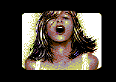
C64 Graphics Competition at Function 2006 : #2
Credits :
Download :
Look for downloads on external sites:
Pokefinder.org
User Comment
Submitted by Raistlin on 28 February 2024
Damn, yes, I know that face so well.
It's the one my wife makes.
Right when she stands on some damned LEGO that one of the kids left around.
AMAZING pic! |
User Comment
Submitted by tempest on 7 April 2007
| just before the money shot |
User Comment
Submitted by Redstar on 12 October 2006
| Nice pixling. Not too inovative subject though. About the throat I kind of agree that it looks slightly strange. Nothing serious but. I think I should have darkened an area at the down right part of it. Well, thats me. Good work anyway! |
User Comment
Submitted by Dane on 9 October 2006
| Madonna, Arnold? I am impressed! |
User Comment
Submitted by Helm on 8 October 2006
| The nostrills I feel could be AAed a bit more, too hard right now. Otherwise, pretty good tech all-around. |
User Comment
Submitted by Jak T Rip on 8 October 2006
| I trust HCL. Natural is good. I love the hair. |
User Comment
Submitted by HCL on 8 October 2006
| Common dudes, they don't *have* to be head-size silicon melons working their way out from the T-shirt. She looks natural, trust me. |
User Comment
Submitted by Radiant on 8 October 2006
| I like the hair as well, but what about the nose, or rather, the lack thereof? :-) |
User Comment
Submitted by Valsary on 8 October 2006
| Another chick? Well drawn. |
User Comment
Submitted by Motion on 8 October 2006
If you ask me, it looks like she just took something up the ass!
@TCH: - I'm in agreement... where are the fun bags, huh?
Great pic JB! Really nice smooth work... |
User Comment
Submitted by Skate on 7 October 2006
@Bizzmo: haha :)
Quite ok FLI pic. I'm sorry about the projector problem at the party.
|
User Comment
Submitted by ptoing on 7 October 2006
| I salute you for making a FLI image that does not look like fairy rainbow dust with all colours all over the place. I like the treatment of the hair. Very nice, even tho it's a copy :) |
User Comment
Submitted by Bizzmo on 7 October 2006
| Really like. Very nice shading. Don't see anything particularly wrong about the throat... but I've not tried putting anything down it... |
User Comment
Submitted by Tch on 7 October 2006
Pretty cool.
Where´re the boobs.. ;) |
User Comment
Submitted by Twoflower on 7 October 2006
| Nice pic in general. Really like the treatment of the hair. The throat is kind of strange though. |
User Comment
Submitted by jailbird on 7 October 2006
Original photo by Mario Testino.
It looked really awful on the big screen as the projector's brightness was set way too high and the lighter colors blended into one big blurry mess.
@Leon: at least it isn't a fantasy remake :P |
User Comment
Submitted by leonofsgr on 7 October 2006
|
|
|
 | Search CSDb |
|
 | Navigate |  |
|
 | Detailed Info |  |
|
 | Fun Stuff |  |
· Goofs
· Hidden Parts
· Trivia
|
|
 | Forum |  |
|
 | Support CSDb |  |
|
 |  |
|


