|
| |
Released At :
Arok 2008
Achievements :
C64 Graphics Competition at Arok 2008 : #3
Credits :
Download :
Look for downloads on external sites:
Pokefinder.org
User Comment
Submitted by Ed on 8 September 2008
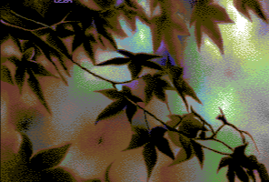
| @Robin: ...that is the one I use to have as wallpaper background during autumn. It has absolutely lovely colour-schemes. |
User Comment
Submitted by Djinn on 8 September 2008
User Comment
Submitted by Edhellon on 29 August 2008
| @Jailbird: I told Leon at the party he fucked it up: no boobs, no win! :) |
User Comment
Submitted by jailbird on 29 August 2008
| Maybe boobs? Yeah, I definitely miss some boobs. |
User Comment
Submitted by duce on 28 August 2008
| really nice mood etc.... but still, something is missing... don't know what... |
User Comment
Submitted by mikme on 27 August 2008
| nice colors, nice autumn :) |
User Comment
Submitted by Matt on 25 August 2008
what amn says.
great picture! |
User Comment
Submitted by G-Fellow on 24 August 2008
User Comment
Submitted by Mäestro AmN on 24 August 2008
| Yes, i think its an excellent artistic picture with the mood of the approaching autumn in all pixels. |
User Comment
Submitted by Ed on 24 August 2008
When I first found this picture some years back, it had a more a blueish background contrasted very bright and powerful red and orange leafs from what I remember.
In this version looks like the hue has been transformed and the brightness and contrast adjusted where the more darker Leon-scales appear. This is probably because it is a hard picture to convert but also because the artist wanted to put his touch to it and show us his interpretation of the autumn... |
User Comment
Submitted by grass on 24 August 2008
| Ez egy jó kép. Remélem nem veszed komolyan a hözöngöket! Csináld amit szoktál! |
User Comment
Submitted by saehn on 24 August 2008
| I like the color choices, wonder what it would have looked like with more color variation on the left side as well? Pleasant pic. :-) |
User Comment
Submitted by Ed on 24 August 2008
Oh man. This image I have had as a windows backdrop for a long time... I even got some similar scales as you :)
|
User Comment
Submitted by Archmage on 23 August 2008
Nice one Leon!
Btw, where are the other compoentries? |
User Comment
Submitted by vili on 23 August 2008
Very nice picture Leon!
Congratulation!
bye: vili |
User Comment
Submitted by Hein on 23 August 2008
User Comment
Submitted by Hoild on 23 August 2008
I would have drawn the leaves in the front non-laced, ie. same data in even and odd fields, and only made the colourful ambient background laced to make it more vibrant.
That would have resulted in a nice visual contrast.
-There is an opportunity to use for good with interlace pics, dear graphicians, try turning it to your benefit.
Apart from the above, another copy by Leon, pixelled with his very well-honed technique.
-Some fresh colour mixing and dithering this time, I like that!
|
User Comment
Submitted by Ksubi on 23 August 2008
| Really nice, wonderful and simple idea. The only thing i dont like is the ugly signature up the top, it stands out too much, esp. in blue text. |
User Comment
Submitted by Skate on 23 August 2008
| Simple concept, perfect adaptation. |
User Comment
Submitted by Motion on 23 August 2008
User Comment
Submitted by Tao on 23 August 2008
| Other than being interlaced (I *hate* interlace, with a few exceptions), this picture is wonderful. |
User Comment
Submitted by Vai on 23 August 2008
|
|
|
 | Search CSDb |
|
 | Navigate |  |
|
 | Detailed Info |  |
|
 | Fun Stuff |  |
· Goofs
· Hidden Parts
· Trivia
|
|
 | Forum |  |
|
 | Support CSDb |  |
|
 |  |
|


