|
| |
AKA :
Spider Pic
Credits :
Download :
Look for downloads on external sites:
Pokefinder.org
User Comment
Submitted by Jammer on 8 February 2009
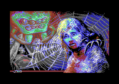
| i've just realised that this warm accent in the figure is blood pouring from nose and mouth - gruesome! :D |
User Comment
Submitted by nada on 28 January 2009
I like spider... spiderweb... i like spinner and I like to spin, uhh !! :)
Veto, thank for your picture ! :D
|
User Comment
Submitted by Hoild on 21 January 2009
To me, it is absolutely refreshing NOT to see the very same trendy colours and dithering as on 95+% of all c64 GFX popping up the last 15 years.
What is even more important, this is truly good graphics in its own very un-c64-looking way. The scene and IFLI changed the way c64 GFX looks, now Veto changes the perception again in a more pleasant way.
|
User Comment
Submitted by Jak T Rip on 20 January 2009
| Oliver! This is one of the best pics ever. It is amazing! |
User Comment
Submitted by Jazzcat on 14 January 2009
| Great work!!! Especially the guy covered in web... |
User Comment
Submitted by Exploding First on 12 January 2009
| Again a very impressive picture. |
User Comment
Submitted by yago on 12 January 2009
Very good, so far my favorite VETO picture.
PS: Looks like the corner of my room |
User Comment
Submitted by Jammer on 12 January 2009
| agree on spider, the rest is brilliant! |
User Comment
Submitted by The Shadow on 11 January 2009
| Beautiful work Veto! Everyone, please vote for Veto. He is among the top of graphic artists! |
User Comment
Submitted by v3to on 11 January 2009
| Thanks for all comments, especially the criticism about the colors of the top-left spiders head. The intention was to build up some kind of emotional contrast to the victim, but admittedly not to harm the overall impression. That context was quite a surprise. |
User Comment
Submitted by saehn on 10 January 2009
| Cool :-) but I agree with Steppe, somehow the large spider's color scheme upsets the whole image. I like how he's done, but he doesn't "flow" with the rest of the picture. Great work on the webbing covering the victim. |
User Comment
Submitted by DeeKay on 10 January 2009
| Wow! Great stuff! Nice Pixeltechnique, unique color-scheme. Where did this guy come from all of a sudden? 8) |
User Comment
Submitted by oys on 10 January 2009
| this is so good and once again in mc, the spider on his shoulder are amazing. the colors, damn this kick ass alot! :) |
User Comment
Submitted by Raffox|HF on 10 January 2009
The izzy bizzy spider went up the water spout down came the rain and washed the spider out out came the sun and dried up all the rain and the izzy bizzy spider went up the spout again.
I like spiders... and webs... and C64 pics with all that! =) |
User Comment
Submitted by Steppe on 9 January 2009
I like pretty much 75% of this picture. And what I like, I like a lot! Wow! the upper left half with the greenish brownish spider is so so...
On the whole a very good pic! |
User Comment
Submitted by ptoing on 9 January 2009
| Came out nice :) Good progression from the first version you showed me. |
User Comment
Submitted by leonofsgr on 9 January 2009
| WOW! great job! ! ! ! ! ! |
User Comment
Submitted by E$G on 9 January 2009
| Simlpy cool job! Along came a spider .... |
User Comment
Submitted by Motion on 9 January 2009
| This is one of the best pastel style images I've seen. I like the little 'Teddy Bear' in the background. Brilliant colours! |
User Comment
Submitted by Zyron on 9 January 2009
User Comment
Submitted by Ed on 9 January 2009
|
|
|
 | Search CSDb |
|
 | Navigate |  |
|
 | Detailed Info |  |
|
 | Fun Stuff |  |
· Goofs
· Hidden Parts
· Trivia
|
|
 | Forum |  |
|
 | Support CSDb |  |
|
 |  |
|


