|
| |
Released At :
7D9 Demo Party
Achievements :
Mixed Graphics Competition at 7D9 Demo Party : #2
Credits :
Download :
Look for downloads on external sites:
Pokefinder.org
User Comment
Submitted by Jak T Rip on 3 January 2010
| brilliant use of colours. 10/10. |
User Comment
Submitted by Skate on 23 December 2009
User Comment
Submitted by Joe on 22 December 2009
Modernity, what an awful word.
Great colorcombination! |
User Comment
Submitted by oys on 22 December 2009
| yeah, very nice, also your older pictures i´ve seen here at csdb are also very good. |
User Comment
Submitted by Hermit on 22 December 2009
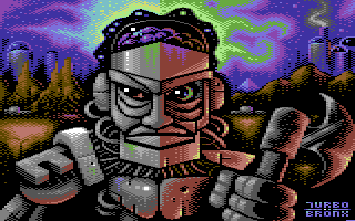
I agree that the beauties of this picture can be found in details (shading, sky, colour fades). It was average for first sight, then I loved to dive into details.
One general thing to mention: Graphicians often use Anti-aliasing in a useless way. An example can be seen in the iron part on the robot's right shoulder. Antialiasing is not about simply outlining the brighter color with a darker, but it should give an illusion of higher resolution on the edges. In other words, one should use the darker colour just for some pixels, not all, on lines sloping in low-resolution.
Anyway, on the other parts of this pic I don't see this thing, and sorry if this one part was suggested to be a shadow instead of anti-aliasing.
All in all it is worth a 8 for me, it seems to be an enthusiastic work with a lot of patience. |
User Comment
Submitted by Yazoo on 22 December 2009
| really nice one, i hope there is more to come from you soon :-) |
User Comment
Submitted by Deev on 22 December 2009
| pretty cool! nice character design and I like the red glow. |
User Comment
Submitted by PAL on 22 December 2009
| I love pixel art and this is pixel art... clever with the color split... the only bad comment I can come up with is that a bit of the red tone on the arm thing that is lighter than all other on the character would be better, it is another element as of now... Maybe spread the sky a bit so it is not that thiny or sharp contraty pixlated in a way.. more of each tone... hmmm... other than that it is a very good image! I LOVE IT! |
User Comment
Submitted by Hoild on 21 December 2009
Good background, the buildings are particularly well pixelled, I really like 'em. The front of the pic could use some improvement, though, to make me award more than a 7...
For a starter, a coherent concept on how the figure is pixelled would help a lot. Parts of it show very good promise, but as a whole it is a mish-mash. |
User Comment
Submitted by Motion on 21 December 2009
Great detail (the background has some great touches) and colour warmth, makes for a good recipie. Love it!
|
|
|
|
 | Search CSDb |
|
 | Navigate |  |
|
 | Detailed Info |  |
|
 | Fun Stuff |  |
· Goofs
· Hidden Parts
· Trivia
|
|
 | Forum |  |
|
 | Support CSDb |  |
|
 |  |
|


