|
| |
Released At :
Forever 2010 | The 8-bit Odyssey
Achievements :
C64 Graphics Competition at Forever 2010 | The 8-bit Odyssey : #9
Credits :
Download :
Look for downloads on external sites:
Pokefinder.org
User Comment
Submitted by NecroPolo on 23 March 2010
Awesome stuff!
I wonder what state of mind made people voting down this one that much in the party... |
User Comment
Submitted by Jammer on 23 March 2010
| well, i assume that it's very hard to appreciate such picture on a beamer, especially that single graphics isn't displayed for a minute or longer. definitely not a party killer but something to enjoy and wonder about at home. |
User Comment
Submitted by Mr. Mouse on 23 March 2010
| It would seem the judges at the party completely misunderstood the originality of this picture. it was certainly worth a much higher place than #9. |
User Comment
Submitted by Jucke on 23 March 2010
User Comment
Submitted by Deev on 23 March 2010
User Comment
Submitted by Hoild on 22 March 2010
I am glad to see GFX releases like this -- fresh as a graphics-in-general it may not be, but it surely is fresh in the stale pond of C64 GFX where most of the competition is still about FLI vs. who-can-emulate-FLI-in-multicolor vs. who-can-do-it-even-in-hires.
The use of red was unnecessary IMO, though, pure grayscale would have been better. |
User Comment
Submitted by saehn on 22 March 2010
| @ duce: Thanks, that's the one I was looking for! I do like your implementation of the design, it works well with hi-res and the colors you've chosen. |
User Comment
Submitted by Ed on 22 March 2010
User Comment
Submitted by The Shadow on 22 March 2010
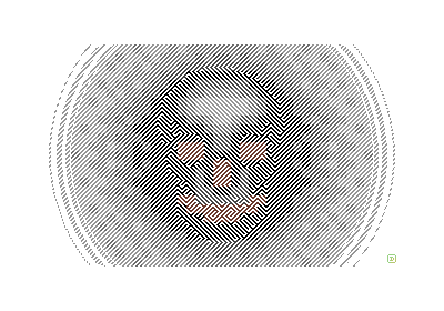
| Cool optical illusion. Staring at the skull makes it appear to go from light to dark and back again. Nice work! |
User Comment
Submitted by Ksubi on 22 March 2010
Theres also an (almost) unreadable font using a similar style...imagine that in a scroller.
Nice work Duce. |
User Comment
Submitted by duce on 22 March 2010
@ saehn : look at the production note, there is a link to the original. You might find other variations of it by google with words such as "skull illusion poster"
So, as long as the idea & design is not by myself, it's not worth of calling "original / fresh / etc" :) But still, it's nice to see that many of you have liked this one, hopefully no one has got any vomiting seizures while staring at it :) |
User Comment
Submitted by saehn on 22 March 2010
| I've seen this done before, advertisement or something. Grrr, going crazy trying to find it! |
User Comment
Submitted by Joe on 22 March 2010
User Comment
Submitted by Conjuror on 22 March 2010
Very interesting and original. I liked checking it out from various angles and distances to see the different effects.
Nice one. |
User Comment
Submitted by Paul Bearer on 22 March 2010
| That thumbnail looks strange if you quickly scroll the browser window up and down. |
User Comment
Submitted by Mace on 22 March 2010
Cool stuff!
I'd LERV to see a demo with this concept :) |
User Comment
Submitted by booker on 22 March 2010
| No nasty screaming faces with hairy parts closeups? Fresh eyepoking effect? Love it! |
User Comment
Submitted by Cobra/Samar on 22 March 2010
User Comment
Submitted by Sander on 22 March 2010
User Comment
Submitted by Twoflower on 22 March 2010
| Brilliant and fresh. Really nice to see that you both are working with patterns and colors to achieve this. |
User Comment
Submitted by Mr. Mouse on 22 March 2010
| Perfect stuff ! Love the artistic and original creation. |
User Comment
Submitted by Ksubi on 22 March 2010
| This is great! Nice to see some original artwork. Love the suttle "background" image, how it contrasts to the strong diagonal foreground lines. Fantastic work! |
User Comment
Submitted by Skate on 22 March 2010
| Original stuff. I liked it a lot. |
|
|
|
 | Search CSDb |
|
 | Navigate |  |
|
 | Detailed Info |  |
|
 | Fun Stuff |  |
· Goofs
· Hidden Parts
· Trivia
|
|
 | Forum |  |
|
 | Support CSDb |  |
|
 |  |
|


