|
| |
|
CBM-Command 2010-05-16 [2010] |
 |
Release Date :
16 May 2010
Type :
C64 Tool
|
Website :
http://cbmcommand.codeplex.com/
Credits :
Download :
Look for downloads on external sites:
Pokefinder.org
User Comment
Submitted by King Durin on 25 May 2010
| Using a custom font is out of the question. The same code runs in both 64 and 128 mode, there are simply some sanity checks the get run to test if you are in 80 or 40 columns. Plus, there is NO MORE ROOM for the assembler routines to do a custom screen. |
User Comment
Submitted by Oswald on 25 May 2010
| or use a 6 pixel wide font =) that gives you 53 chars, 3 filesize+1 sep+16 filename+1sep+3 filetype+outer/inner vertical line. |
User Comment
Submitted by JackAsser on 25 May 2010
| Cool, but skip the vertical lines completly and simply invert the whole view that's currently active. |
User Comment
Submitted by King Durin on 25 May 2010
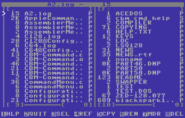
OK, I've squeezed as much space as I can. See the new screenshot, or download the new file with the -rc on the end. The bug mentioned here is fixed as well in the -rc version.
EDIT: I removed the new version. I'll let the screenshot speak for itself. If you are interested in the new version then contact me. I plan on doing the official 1.0 release on Wednesday barring any more bug reports. |
User Comment
Submitted by WVL on 24 May 2010
I agree with Frantic 100%
As a fix, i'd suggest using a custom charset so you can add vertical lines to letters or numbers. Another solution is making the vertical lines out of sprites.
You really have to show all 16 chars of the filename, otherwise it's just.. well, like CMD showing only 8 chars and that's just a total pain in the ass :) |
User Comment
Submitted by Frantic on 24 May 2010
@King-Dürin: You could also drop the two outer vertical lines. As far as I understand, they don't really add anything over and above more visual similarity to other commanders.
..and in fact, the inner two lines does not seem to be strictly necessary either. Even if they were removed, there would still be the one char wide cursor marker column in between them, which means that it would probably not look very messy anyway. |
User Comment
Submitted by King Durin on 24 May 2010
| @Frantic: Thank you for the bug report. I'll get on that tonight after work. As for the filename, I could gain one more character by only doing 2 dots instead of 3. I would really want community consensus on dropping the file type from the listing. To me it's very important, but I could be wrong for most people. |
User Comment
Submitted by Frantic on 24 May 2010
It would be nice to see the whole filename. I know it is hard to make it fit on a 40 column display, but... 16 chars filename + 3 chars file size + 1 char file type = 20 chars, so with some more compact design, it could actually fit. For example, it would be nice to squeeze the four chars involved in file type and file size into two or three chars, or something like that (perhaps by placing this stuff in a sprite, or so). Showing only 8 chars of a file name (which is the case now when the filename does not fit in the display) just ain't satisfactory and the screenshot itself demonstrates this perfectly, since the names of some of the files cannot be distinguished from each other right away. I mean, at least for me the file name is actually the most crucial info, in most cases, and the file type is least crucial. The currently selected file could also be indicated by cursor blinking, rather than by wasting a separate char column...
Another possibility might be to use the full screen width for the file display, and then switch screens rather than "windows" when moving to another device. (That is not in accord with the general "commander look", I know, but it might actually be more handy for people who use the 40 column display of the C64, which should not be a minority in this case.)
Yet another possibility would be to split the window horizontally rather than vertically.
There is also a minor bug when moving from "window 1" to "window 2" and then pressing space. If no dir has previously been shown, a bogus list of deleted files with size 0 will be displayed. |
User Comment
Submitted by King Durin on 21 May 2010
| Has anybody used the D64 functionality of this version? Can you guys tell me if there are any bugs that need to be rectified before releasing a beta version? |
User Comment
Submitted by Frantic on 18 May 2010
| @Moloch: Even though separate releases should go into their own entries, that doesn't mean that every separate release has to be added in the first place. Not that I care, but.. :) |
User Comment
Submitted by Tom-Cat on 18 May 2010
| Nice release. Getting pretty usefull now. One thing: Is it possible to allow entering all possible characters when renaming files? I.e. the ones that you get with Commodore key? I know stuff like control codes will prolly not go, but graphic characters should be doable? |
User Comment
Submitted by Moloch on 17 May 2010
I have two views on this really. Releasing every few days will get you important feedback to making your project, if you care about such things. Releasing every few days can also turn people off, because it seems like an overdose of underdeveloped software.
I'll continue to put all releases here, considering others have done the exact same thing in the past (ie: HOXS) _and_ it is the rule of CSDb that each update requires it's own entry. |
User Comment
Submitted by Mace on 17 May 2010
CSDb is just another place where releases are uploaded, whatever the original source was.
So I don't blame Moloch... |
User Comment
Submitted by King Durin on 17 May 2010
| I didn't release this version to CSDb as was requested of me. Somebody else did. |
User Comment
Submitted by Mace on 17 May 2010
For me personally in my humblest of opinions, you don't have to release every single version with such a short interval (every 3 to 4 days).
Once a month would be just fine... |
|
|
|
 | Search CSDb |
|
 | Navigate |  |
|
 | Detailed Info |  |
|
 | Fun Stuff |  |
· Goofs
· Hidden Parts
· Trivia
|
|
 | Forum |  |
|
 | Support CSDb |  |
|
 |  |
|


