|
| |
AKA :
Three Wise Men
Credits :
SIDs used in this release :
Download :
Look for downloads on external sites:
Pokefinder.org
User Comment
Submitted by Motion on 24 January 2008
Thanx for all the comments - very much appreciated! :D
|
User Comment
Submitted by elfh on 6 January 2008
| i liked the music in a first part very much! overall design and gfx is also good. |
User Comment
Submitted by Rough on 27 December 2007
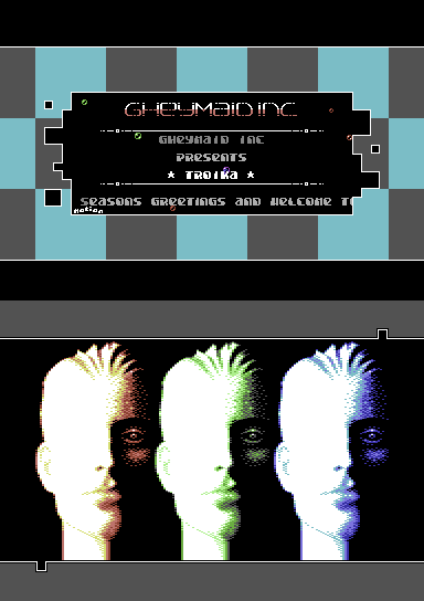
| Really nice design. The head seems like a soft version of Max Headroom. |
User Comment
Submitted by Steppe on 27 December 2007
| Wow, I didn't know Motion can code! Fine design in the intro and quite plastic looking graphics in the second part. Great dithering! |
User Comment
Submitted by chatGPZ on 25 December 2007
Quote:
Finally a release from Intensity's fake group! Not quite Crypt level, though.
you sir, need help. |
User Comment
Submitted by Motion on 25 December 2007
@Vanja: Thanx for your comments, all valued. The intro screen was designed in 1998 and based on some of my unreleased Amiga code. So yeah, you were "on-the-ball" there.
The scroller only fades out to give the impression of a shadow, hence no fade-in on the right (but I must admit, I did consider that, also).
The second part was just meant to be a gfx release (which is how I originally made the entry in CSDB). Then I just opened the Top/Bottom borders and added some sprites over the rasters (yep, those aren't part of the pic - would have been alot easier if they had been!).
I didn't have anymore time to add any other fx, unfortunately, and I only barely managed to release this for Xmas in Europe. I released this prod at 3.15am here in New Zealand! Yes, I am still tired! ;D
|
User Comment
Submitted by Mermaid on 25 December 2007
The intro is very pretty, has an early 1990's amiga feel to it that I love, with the chessboard and the bubbles, and the cute Motion-sig. Good music as well.
<Nitpicking> The one thing I dislike is how the scroller fades out on one side and doesn't fade in on the other, I'd rather it was faded on both sides, or that it didn't fade out at all and that you could see the letters through the black hole.</nitpicking>
The main part, I like the heads and the music a lot (they fit perfectly together), and it keeps design elements from the intro, good stuff. It left me wanting more though, some animation on the heads perhaps, or some scroller or sprite action. |
User Comment
Submitted by Intensity on 25 December 2007
| woah, the first tune from psycho rocks! :) Neat Design also! |
User Comment
Submitted by SIDWAVE on 25 December 2007
User Comment
Submitted by Motion on 25 December 2007
@Fman: I see what you mean! ...I coded it and even I don't know what's going on. ;D
|
User Comment
Submitted by Mace on 25 December 2007
Very particular style that has potential!
Nice graphics, too. |
User Comment
Submitted by FMan on 25 December 2007
Finally a release from Intensity's fake group! Not quite Crypt level, though. The intro mentions second part, but there is just one, so the intro counts as a demopart?
|
User Comment
Submitted by chatGPZ on 24 December 2007
Quote:
intro/demo and not a gfx release...
agreed, and changed. |
User Comment
Submitted by d0c on 24 December 2007
| everything is great :) but again an intro/demo and not a gfx release... |
User Comment
Submitted by Oswald on 24 December 2007
| I'd be more pleased with some nice effect. the pic is very well done tho. |
User Comment
Submitted by Conrad on 24 December 2007
Superb design, gfx and music! The intro looks very Amiga style, especially the bubble starfield. ;-)
Many happy returns, Andrew & Marcin! |
User Comment
Submitted by Richard on 24 December 2007
Nice intro screen :) Cool music + gfx.
Merry Christmas |
User Comment
Submitted by Yazoo on 24 December 2007
User Comment
Submitted by null on 24 December 2007
User Comment
Submitted by Motion on 24 December 2007
| @Violator: Thanx pal! ...and to think, they said we were a FAKE group. Ha! :D |
User Comment
Submitted by A3 on 24 December 2007
| What a nice comeback release from Motion if you can call it that. |
User Comment
Submitted by chatGPZ on 24 December 2007
| yay, nice! i really like the intro too, some good design ideas in this production. |
User Comment
Submitted by Motion on 24 December 2007
| @Matt: It was inspired by that, funnily enough, after watching videos of MAX on YOU TUBE, back in the 80's. Bring back Max! :D |
User Comment
Submitted by Matt on 24 December 2007
| cool, I really dig the graphics! max headroom without glasses? lol |
User Comment
Submitted by Motion on 24 December 2007
A very merry christmas to you all! :D
|
|
|
|
 | Search CSDb |
|
 | Navigate |  |
|
 | Detailed Info |  |
|
 | Fun Stuff |  |
· Goofs (1)
· Hidden Parts
· Trivia
|
|
 | Forum |  |
|
 | Support CSDb |  |
|
 |  |
|


