|
| |
Released At :
Black Birdie 3
Achievements :
C64 Graphics Competition at Black Birdie 3 : #1
Credits :
Download :
Look for downloads on external sites:
Pokefinder.org
User Comment
Submitted by Oswald on 25 September 2006
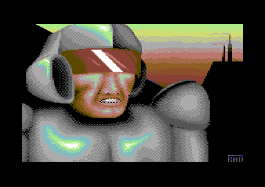
| radiantx, a piece of advice before starting to pixel make a sketch, also you should read some material about drawing. |
User Comment
Submitted by Radiant on 25 September 2006
| Deev: I _want_ them to be harsh. I don't house any pretentions about being good at this, and honest criticism makes it so much easier to improve than people just saying that it's nice to see me doing stuff etc. :-) |
User Comment
Submitted by Deev on 25 September 2006
Respect to you for trying to pixel 100% no copy works when you're still starting out, but even if you don't want to copy directly, you should still carefully observe how human faces look. For example, in your pic the nose begins too low down, it appears virtually flat to the face until the bottom of the visor, but on a real face the nose would begin to move outwards level with the eyes and would still not be flat above this. You should probably also have more space between the bottom of the nose and the mouth, and the mouth would probably be a little larger compared to the nose. The face isn't too bad, but little things like this would help it look better. It takes a talented artist to be able to draw good faces with no source at all!
I agree with what bizzmo says about lighting (also, try to use more black and white for dark and light sections). A little more detail in the armour proably would've been better, as it is, it reminds me slightly of those early 3D graphics where everything was visibly made from simple shapes.
Hope these comments don't sound too harsh! Your pixelling skills are improving and you seem fine with dithering, basic anti-aliasing etc. I've seen a lot worse! |
User Comment
Submitted by Bizzmo on 24 September 2006
I think it would help if you work on your use of light and shadow - these are the things that create the feeling of depth.
In this picture the light source seems a little inconsistent, but mainly straight on to the subject. This means that features such as the nose etc do not cast shadow on the rest of the face/cheeks and tends to make the face look a little flat.
Keep up the work (some of my early pics were much worse than this!) |
User Comment
Submitted by Radiant on 24 September 2006
| Thank you Style. More feedback would be appreciated, as I really don't see how I should have drawn it differently. Especially some words from blackdroid would be nice, seeing as he rated this worse than my previous, really lame-ass, gfx. I thought I got the facial features a lot better this time, but apparently not. :-/ |
User Comment
Submitted by Style on 24 September 2006
Nice shading, nice composition. The face looks a little weird tho, lacks depth and the jaw/mouth are a little too straight horizontally......
Nice one tho!
|
|
|
|
 | Search CSDb |
|
 | Navigate |  |
|
 | Detailed Info |  |
|
 | Fun Stuff |  |
· Goofs
· Hidden Parts
· Trivia (1)
|
|
 | Forum |  |
|
 | Support CSDb |  |
|
 |  |
|


