|
| |
 |
Released by :
JSL
Release Date :
19 May 2015
Type :
C64 Graphics
(MultiColor)
|
Credits :
Download :
Look for downloads on external sites:
Pokefinder.org
User Comment
Submitted by Hammerfist on 29 May 2015
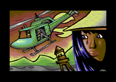
Actually, what you refer to as a lamp on a stool looks like a watch tower to me. :)
As for why the girl looks odd: could it be because the center of her hat is not above the center of her head, but outside the picture and roughly over her left ear? It gives the appearance of her having a very flat head inside the hat and of her having a hat so big her twin sister could fit under it together with her :P Other than that, I like this one a lot. Didn't recognize it as a JSL picture at first, which in this case is definitely a compliment. |
User Comment
Submitted by drake on 27 May 2015
| Fair enough. and i agree, sometimes the perspective is kind of weird. but the picture has not been drawn to make it look realistic though. |
User Comment
Submitted by E$G on 19 May 2015
@drake: consider that I'm not a graphician so I judge the pic for the feeling that I receive from his vision. Anyway I'm a huge comix reader (more than 20000 comix) and I spent most of my life watching c64 & amiga releases.
So the main thing I don't like is the girl face, if I split it in the half it seems that got different look, maybe are the hair that trick my perception. Most of the pic is weird for me. The lookout tower has the inclination of the helicopter, it seems a mix of 3 parts background, girl face and the helicopter. Great choice of colors. This is JSL art. A aort of cubism in action like it or not! |
User Comment
Submitted by DKT on 19 May 2015
Sad war, like every war.
28th May will be the anniversary of the beginning of the Vietnam war. |
User Comment
Submitted by The Shadow on 19 May 2015
| The colors are done very well! Wow. The way the lamp on the stool is leaning has the appearance almost as if wind was shoving it toward the left. |
User Comment
Submitted by drake on 19 May 2015
| @E$G, what is wrong with the way he draw the picture? |
User Comment
Submitted by Medicus on 19 May 2015
User Comment
Submitted by E$G on 19 May 2015
| I like the subject and the colors, not the way was drawing. |
|
|
|
 | Search CSDb |
|
 | Navigate |  |
|
 | Detailed Info |  |
|
 | Fun Stuff |  |
· Goofs
· Hidden Parts
· Trivia
|
|
 | Forum |  |
|
 | Support CSDb |  |
|
 |  |
|


