|
| |
Released At :
miniMO 2009
Achievements :
Mixed Competition at miniMO 2009 : #3
Credits :
Download :
Look for downloads on external sites:
Pokefinder.org
User Comment
Submitted by Raistlin on 13 March 2024
| I keep finding Leon pics where his name isn't listed in the credits .. was there a reason why? Seems .. strange? |
User Comment
Submitted by leonofsgr on 19 January 2010
thanx all comments and votes! pls waitin' my another hi-res pix... ;_)
|
User Comment
Submitted by v3to on 18 January 2010
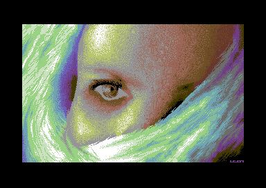
| it is a real pleasure watching your hires gfx leon. the shape fits the matrix, the dithering, the colors... at all nicely executed. the issue depending the anatomy which is mentioned in previous comments is there, but imo it it not a big deal. |
User Comment
Submitted by booker on 5 January 2010
User Comment
Submitted by jailbird on 31 December 2009
Niccce. Awesome hi-res witchcraft there! The pixelling technique is outstanding, as always.
But the facial anatomy (which seems skewed and unnatural) makes the overall impression a bit uneasy for me. |
User Comment
Submitted by FATFrost on 31 December 2009
| You only have to zoom out a bit to make a good hires pic. :) |
User Comment
Submitted by The Shadow on 31 December 2009
| As always Leon has done a fine job. The colors are exquisite! |
User Comment
Submitted by Hermit on 30 December 2009
Again a nice Leon hires artwork! I like the dithering methods, the style is exactly what I have got used to, while I was watching your MC/lace works before.. just resoluted twice more :)
Seeing these new hires piccies, I feel like there are no limits in hires :) |
User Comment
Submitted by Skate on 30 December 2009
User Comment
Submitted by Yazoo on 30 December 2009
| a good hires pic leon. nice technique and good execution. congrats. just the eyes look a little bit unfinished. |
User Comment
Submitted by Deev on 30 December 2009
| realy nicely done, at first glance I would never have guessed there was no fli at work. |
User Comment
Submitted by Joe on 30 December 2009
Wonderful!
I find the choice of palette to be more daring in the graphics you made for the demo Cute Overdose
and a bit to conventional for the theme here.
The dithering diagonals is great! |
User Comment
Submitted by Ed on 30 December 2009
Aaahhh the limitations! :)
Splendid work! |
|
|
|
 | Search CSDb |
|
 | Navigate |  |
|
 | Detailed Info |  |
|
 | Fun Stuff |  |
· Goofs
· Hidden Parts
· Trivia
|
|
 | Forum |  |
|
 | Support CSDb |  |
|
 |  |
|


