|
| |
Released At :
Primary Star 2006
Achievements :
C64 Graphics Competition at Primary Star 2006 : #2
Credits :
Download :
Look for downloads on external sites:
Pokefinder.org
User Comment
Submitted by PAL on 9 May 2015
| ehhh no... on a pcdisply it looks the same... ;-) |
User Comment
Submitted by Smasher on 9 May 2015
User Comment
Submitted by PAL on 9 May 2015
| when i look at interlace in vice I just set the speed of vice to 120%. |
User Comment
Submitted by PAL on 9 May 2015
| what a moody picture... love it! |
User Comment
Submitted by celticdesign on 9 May 2015
User Comment
Submitted by Testa on 27 September 2008
| Wauw.. nice piccy... i wish i can paint like this... cool |
User Comment
Submitted by HCL on 22 August 2008
User Comment
Submitted by Skate on 24 August 2006
User Comment
Submitted by DCMP on 19 August 2006
| I like the obvious manual labor that is in this picture. |
User Comment
Submitted by Hate Bush on 6 August 2006
| blu funk is the fact. like this one. |
User Comment
Submitted by Oswald on 6 August 2006
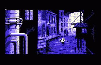
| promising, nice atmosphere, but I have to agree with ben, the tubes are too 2d. |
User Comment
Submitted by blackdroid on 6 August 2006
| @ben: does "koala" suite you better, this pic is made with either mci or ifli, so in other words id prefer non interlace. I like the lack of color extravaganza in this picture. |
User Comment
Submitted by Helm on 6 August 2006
| Multicolor as in 3 colors plus universal per character, widepixels. not multicolor as in various different shades used. I agree the blue palette is good for this. |
User Comment
Submitted by blackdroid on 6 August 2006
| could have been a multicolor pic and most likely look better imho. I do like the motive though, and the depth. |
|
|
|
 | Search CSDb |
|
 | Navigate |  |
|
 | Detailed Info |  |
|
 | Fun Stuff |  |
· Goofs
· Hidden Parts
· Trivia
|
|
 | Forum |  |
|
 | Support CSDb |  |
|
 |  |
|


