| |
Released At :
Intro Creation Competition 2018
Achievements :
C64 Demo Competition at Intro Creation Competition 2018 : #10
Credits :
SIDs used in this release :
Cracks which use this intro :
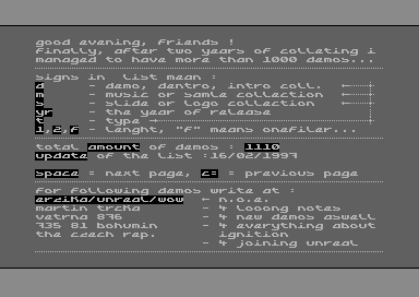
Scrolltext and other text in this release : ()
Download :
Look for downloads on external sites:
Pokefinder.org
User Comment Submitted by Doc Snyder on 15 May 2019 User Comment Submitted by iAN CooG on 19 January 2019
L'Abbaye des Morts intro uses Pains_n_Aches_part_1.sid tune #3, fits the theme of the game | User Comment Submitted by Mr.Ammo on 13 January 2019
That tune!! I do not want to press space!! ;-) | User Comment Submitted by B3L4 on 13 January 2019
For some reason it give me the feeling I have seen it somewhere already :) like back in the 80's on my old good breadbin. | User Comment Submitted by Zardax on 12 January 2019 User Comment Submitted by Yazoo on 12 January 2019
this may technically not be the best in the compo, but it's one of my top 5 icc-favourites, as it for me has the perfect "intro look and feel"... everything fits together in an aesthetic way. and - i fell in love with rasterbars in the 80s... and that has never changed :-) thumbs up | User Comment Submitted by ChristopherJam on 11 January 2019
Nice fade on the rotating bars :) | User Comment Submitted by 0xDB on 10 January 2019
Needs more 10s! Good stuff! | User Comment Submitted by Slator on 8 January 2019
totally love the style, well done, me old fart likes! | User Comment Submitted by Oswald on 6 January 2019
indeed, feels like one of those intros from the late 80's early 90s. classy! | User Comment Submitted by Frantic on 6 January 2019
Very nice! One of my favourites. The execution is on the spot. | User Comment Submitted by psych on 5 January 2019 User Comment Submitted by ws on 5 January 2019
@magnar it is a spectrum, though | User Comment Submitted by Bob on 2 January 2019
like the rasterbars going around the logo, nice touch. | User Comment Submitted by Magnar on 1 January 2019
Shit, and I thought I would finally get to see the game Bandersnatch for real - and on the C64 instead of that Netflix "Black Mirror" movie lame Atari crap! ;) Cool stuff, mates! | User Comment Submitted by G-Force on 31 December 2018 User Comment Submitted by Joe on 31 December 2018 User Comment Submitted by Jammer on 31 December 2018
'88 is strong with this one but in very positive way! ;) Neat! | User Comment Submitted by iAN CooG on 31 December 2018
very nice, and I like the screen transitions on enter/exit. | User Comment Submitted by ws on 31 December 2018
Blasts me back to the past. <3 No open borders though ;-) Rasters and Tune exceptional. | User Comment Submitted by Flex on 31 December 2018
I remember that color effect being called "Death Colours".
Probably thanks to this release Death Colours . Could this release be the origin of the effect? | User Comment Submitted by Maxlide on 31 December 2018 User Comment Submitted by TheRyk on 31 December 2018
yeah make rasters great again! | User Comment Submitted by chatGPZ on 31 December 2018
very 1988 ;) i remember how happy i was back then once i worked out how this "window shade" raster fx works \o/ | User Comment Submitted by chancer on 30 December 2018
glad someone else remember the scg's intro.. got mr stark and toy to make me one based on their logo back in the day. Road Runner +3 | User Comment Submitted by celticdesign on 30 December 2018
Lovely oldschool vibes! <3 | User Comment Submitted by Ksubi on 30 December 2018
Lots of inspiration here from legendary intro's as cited in the scroller. And the result is really nice. I might have changed some of the colours, here and there, but overall a lovely result! <3 |
|
|
|
| Search CSDb |
| Navigate | |
|
| Detailed Info | |
|
| Fun Stuff | |
· Goofs · Hidden Parts · Trivia (1)
|
|
| Forum | |
|
| Info on other sites | |
|
| Support CSDb | |
|
| |
|